Guiding Tanya to create her first Assistant with fewer steps in less time
Timeline: 2 weeks.
Deliverables: High fidelity mockups, demo, design specifications.
Design lead: Marilyn Osei.
UX, visual: Diana Alayon.
Illustration: Pascal Potvin.
Product management: Madison Heck.
Engineering: German Attanasio, Mamoon Raja, Christopher Karle.
The problem
“Can’t find Watson Assistant log-in” is a pain user expressed. Findability is an issue as there’s no straight path to Watson Assistant as an independent product, but as one of the many services you may find in the dashboard instead when you go to your IBM Cloud account. Once you find Watson Assistant and click that, there’s a button for “Launch tool”.
Changing this path was out of the scope, and as we were introducing a completely new UI - the New Watson Assistant Experience, we needed to provide Tanya with something that allows her to start creating her first Assistant right away, without getting stocked in the unfamiliar look of the tool we were presenting.
The goal
Tanya is given a start on creating her first Assistant in less time as possible: don´t make me think, just tell me what to do next.
Tanya can choose the language for her Assistant and the domain.
Tanya is guided to give her Assistant a name, based on the domain her Assistant will cover.
How it works (old experience)
How it will work (new experience)
Understanding what we’re solving for
When we got this requirement, PM was talking about a wizard and it seemed that it was what we needed. Until we started to ask questions:
Do we have that many steps to break down?
How complex do the tasks are that make sense to split them Into smaller chunks?
How are we defining these steps in documentation/support?
Is this a one-time setup task you can’t cancel out of?
Are there multiple steps to their setup which you can navigate forward and back through?


Initial explorations

Further explorations


The outcome
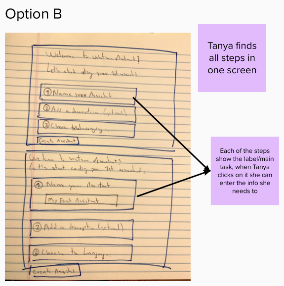
We decided that the tasks were simple enough to present them all on one page. What became relevant was the order of the steps, and the content - communicating to Tanya what step was mandatory vs. optional, what could or couldn’t be changed later, and what was going to be visible to the public vs. internally only.
Where it fits in the user flow
This screen will show right after Tany launches the tool (Watson Assistant) from the list of resources. Once Tanya completes the mandatory steps and hits the “Create assistant” button, she lands on the “Home page” of the assistant she just created. This home page is a new experience, with a brand-new IA (Information Architecture) as well as a new look and feel.
A walk-me-tour will show once Tanya lands on the home page. This was being designed by a different team, the reason why I’ve not included it here as part of my work.


