Case Study - Fun 2 Give
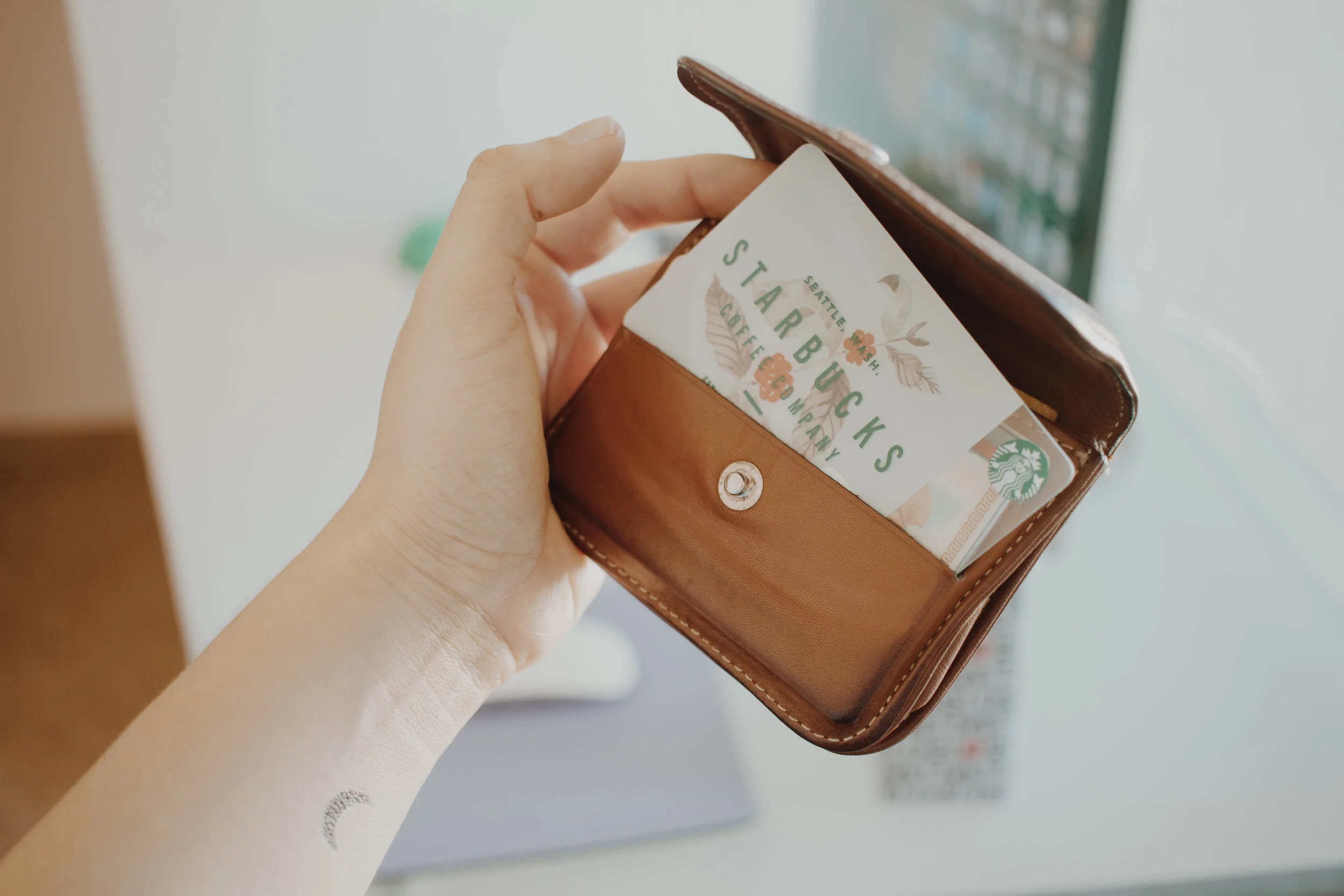
Gift cards are supposed to make gift-giving simpler, reducing the need to worry about the recipient’s tastes and what specific items he or she might already have. There are physical cards made of plastic or coated paper that carry a magnetic stripe that encodes the value, and virtual cards which are the electronic form of the physical ones. I approached this project with the goal to incentive the use of electronic gift-cards.
I takes time to go to the store to get the physical gift card. There are options available to get them on line, this will save you valuable time but you might be paying delivery fees. At some point, physical cards become hard to manage for the recipient: how do you keep track of your gift cards? Are you going to carry them with you all the time so you can access theme whenever you happen to be close to the store for redemption? Did you know that, even though gift cards cannot expire any earlier than 5 years (Federal Reserve), some of them charge extra fees for late use?
Physical gift cards are commonly forgotten in a drawer full of clutter. They might end up not used at all.
Fun 2 Give is a web platform that allows you to buy and send e-gift cards in real time, making it easy for you to give the perfect gift card and conveniently manage them from any device.


User Personas and Scenarios
As I focused on the buyer’s experience as everything else was outside the project scope, I identified four different users involved in the process of getting an electronic gift card:
The Buyer
The Merchant
The Payment Processor
The Recipient
Identifying who my users are and creating personas helped me to understand their needs and goals, what are they trying to accomplish using my product, and how my design meets their expectations.
User Journey
From the user journey map we have a visual representation of the process a customer goes through Fun 2 Give to achieve a goal: to buy and send a gift card. We can get a sense of our customers' motivations, in other words, their needs and pain points. This helped to understand how to structure our touch-points to create the most effective and efficient process for our customers. A customer journey map maps out the current process, from the first to final touchpoint, to see if your customers are currently reaching the goals and, if not, how they can.
This is the ideal linear journey from A to B. However, buyers often take a back and forth, cyclical, multi-channel journey.
Site Architecture
After an open card sorting activity with 5 users, valuable insights were gain to better structure the information in our site. Considering to buy a physical or an electronic gift card seemed irrelevant to our users, while shopping by occasion and brand made more sense when thinking about gifting.


Purchase as a guest
Usability Testing
Having created an interactive low fidelity prototype in Invision, I conducted usability studies with 8 participants. Some were exploratory test. In this particular video I show the interaction of a user who was given a very specific task to perform:
Your task is to buy an e-card from REI, with your debit card, and send it instantly. You are a returning user not a new user so you will login with your e-mail account.
Product Specifications
After documenting and analyzing the insights from the usability studies conducted, I have a clear view of the product specifications:
•Product catalogue - shop not only brands but experiences. You won’t need to download different Apps to buy the brands that you like. Find everything in one stop.
•Login options - No need to create an account, you can shop as a guest.
•Redeem without downloading the app or registering in our site - for the recipient.
•Offer payment methods - implement standard and secure payment methods such as credit, debit and PayPal.
•Offer a split payment option - split payment between friends, this allows the user to give higher value gifts.
•Gift card wallet - manage all your gift cards and have them always available in your smartphone so you can use them whenever you want to.
•Notifications and reminders - get reminder of expiration dates so you can use them before the due date. Be notified when your recipient receives your gift card.
•Delivery options - allow the user to send a gift card immediately or on a specific date, regardless of if is an electronic or physical gift card. No delivery fees, be fare with the user.

