Creating content for a payment app.
HANDSHAKE
I worked with mentors of The UX Writers Collective for this project.
Timeline: 4 weeks, academic project.
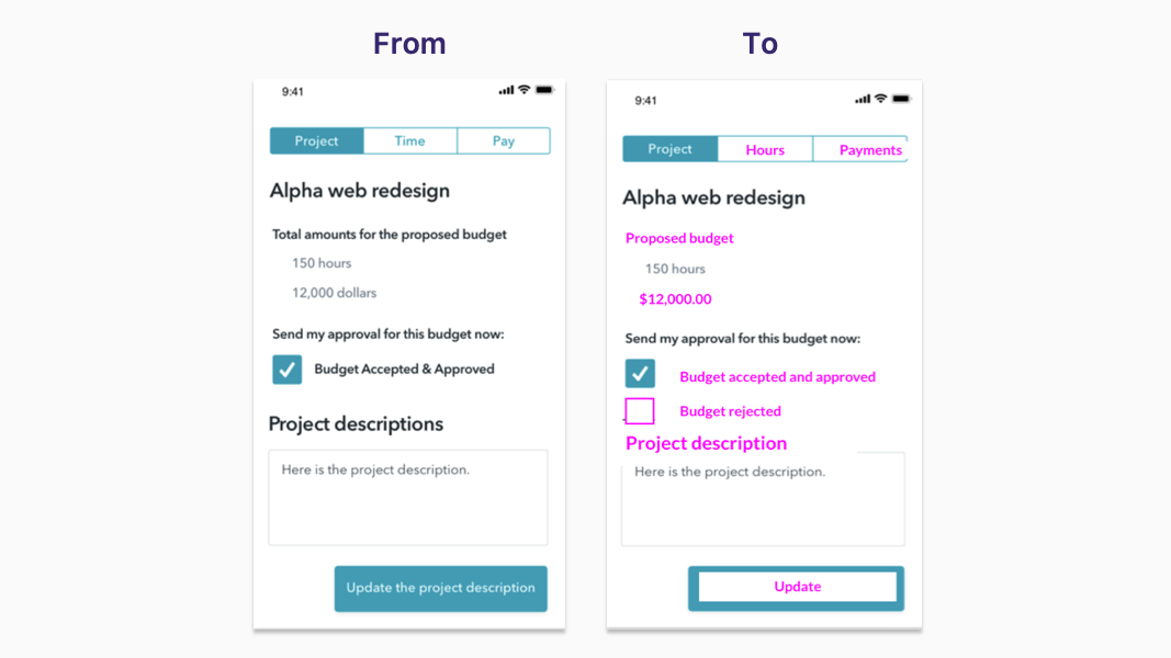
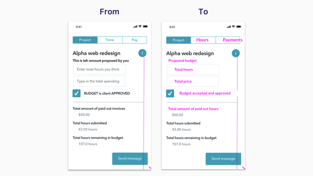
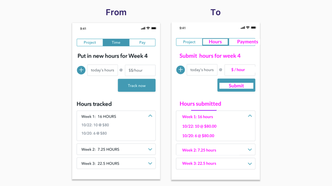
My Role: Defining voice, tone, and style. Deliverables: UI text edits, product content and new screens suggestions.
About the fictional app
Handshake is a payments app designed for Freelancers and Business Owners: one uses it for billing and the other for paying
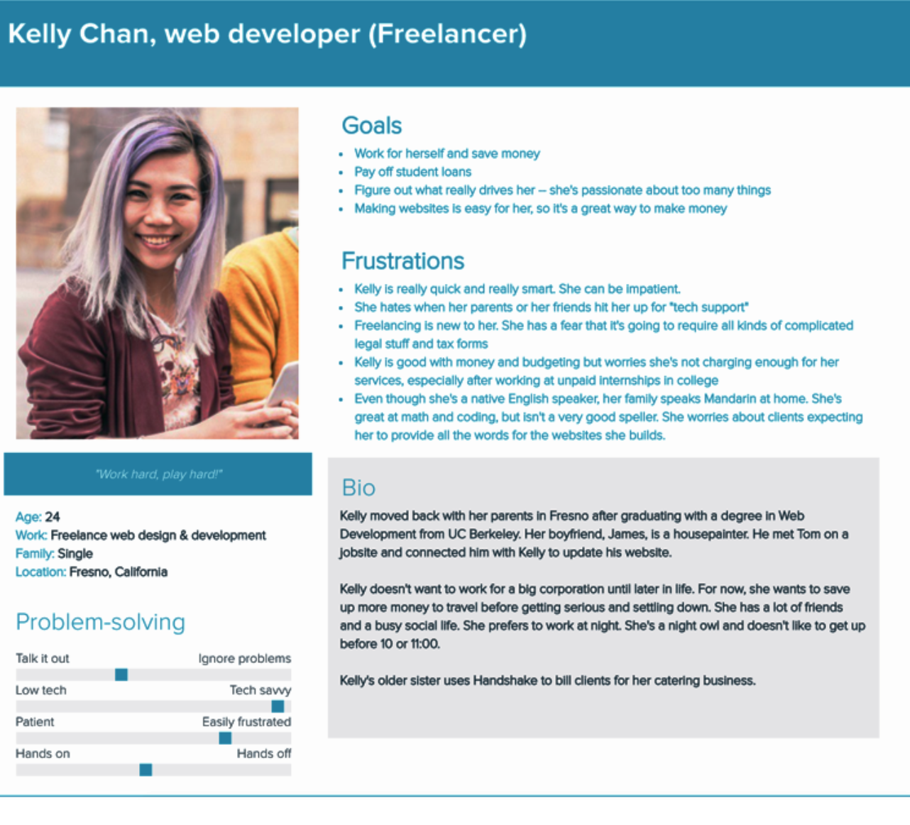
User personas
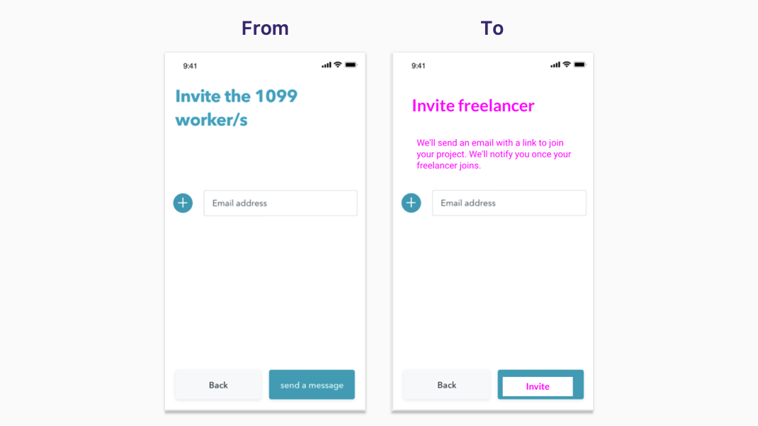
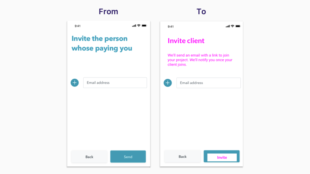
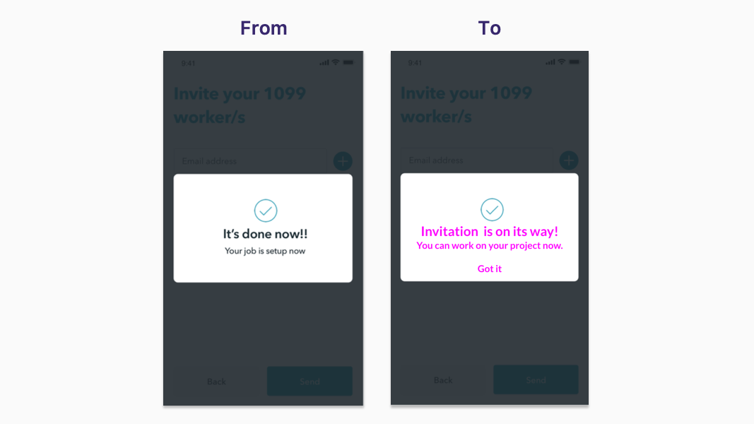
Samples of UI text I wrote
Handshake app: Sign up
Handshake app: Sign up
Handshake app: Sign up
Handshake app: Business Owner set up
Handshake app: Business Owner set up
Handshake app: Business Owner set up
Handshake app: Business Owner set up
Handshake app: Freelancer set up
Handshake app: Freelancer set up
Handshake app: Freelancer set up
Handshake app: Freelancer set up
Handshake app: Set up confirmation
Handshake app: Business Owner ongoing use
Handshake app: Business Owner ongoing use
Handshake app: Business Owner ongoing use
Handshake app: Freelancer ongoing use
Handshake app: Freelancer ongoing use
Handshake app: Freelancer ongoing use
Handshake app: Freelancer ongoing use
Handshake app: Freelancer ongoing use
Handshake app: Messaging
Handshake app: Messaging
Design recommendations to improve usability
Consider multiple selections to allow the user multiple payments at once, instead of repeating “Pay”
Remove the “Send MSG” button from the payments screen and replace it for a “Pay” CTA button
Make the “Message” feature visible all the time and not hidden into a specific category (Project, Hours; Payments)


