
Offering an Integrations Catalogue for Tanya to connect her Assistant to different channels to meet her customers where they are

Timeline: 4 weeks.
Deliverables: High fidelity mockups, demo, design specifications.
Design lead: Janelle Arita, Marilyn Osei.
UX, visual: Joanne Lo, Diana Alayon.
Product management: Madison Heck.
Engineering: Dan O’Connor.
The problem
In the classic Watson Assistant Experience, the way Integrations was presented wasn’t successful:
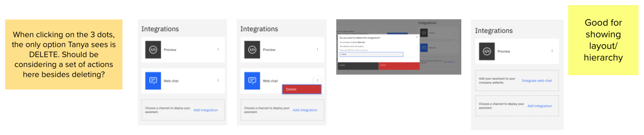
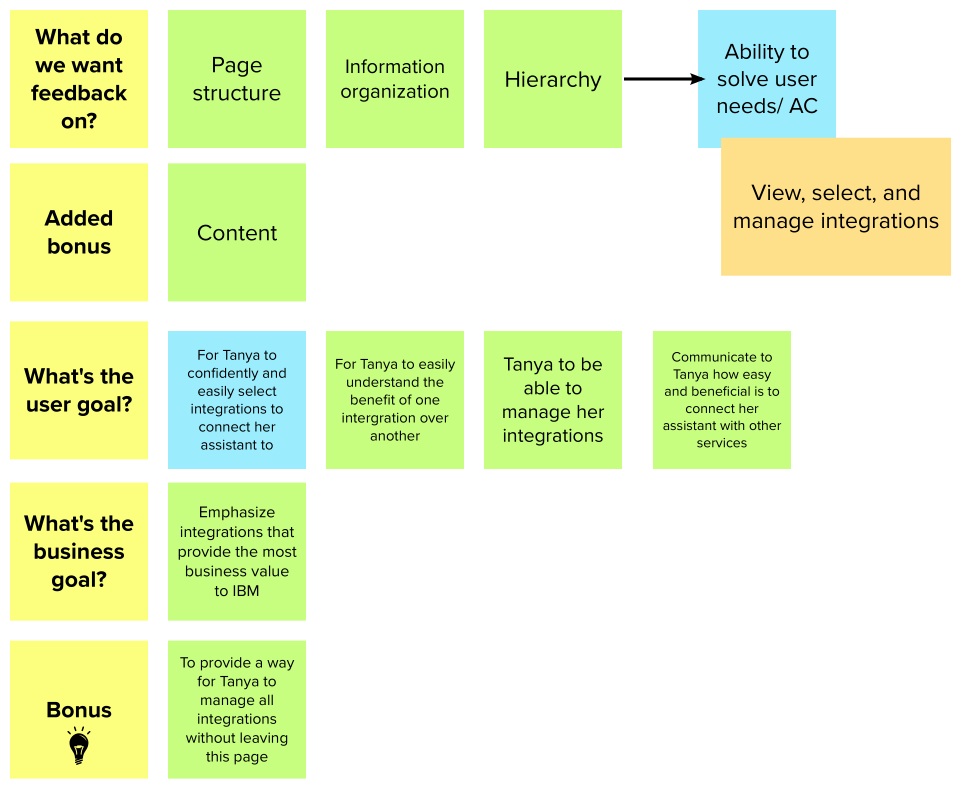
Tanya couldn’t easily understand the benefit of one integration over another.
Tanya didn’t have a centralized place to manage her integrations.
It wasn’t easy for Tanya to distinguish between build-in services (requiring little to non-effort to connect her Assistant) from other extensions and third-party services.
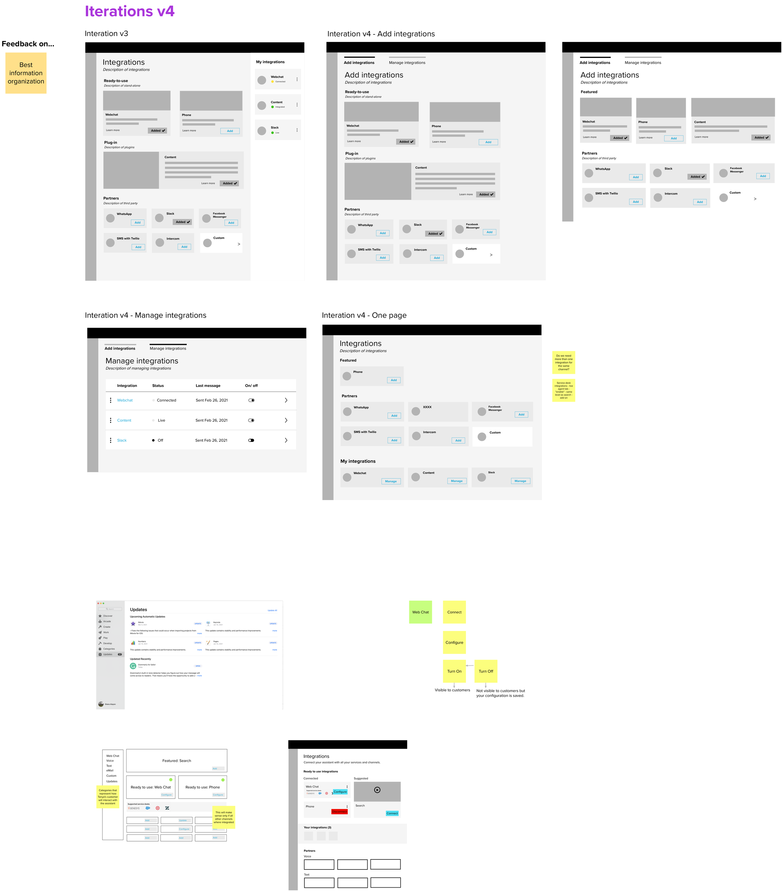
We needed to shift our message from “This is all the things you can connect your Assistant to ” to “This is the benefit you get when you connect your Assistant to X, Z, Y”. It was not only a matter of the words but the page structure. We needed to work on hierarchy and information organization.
The goal
Tanya confidentially and easily views, selects, and manages integrations.
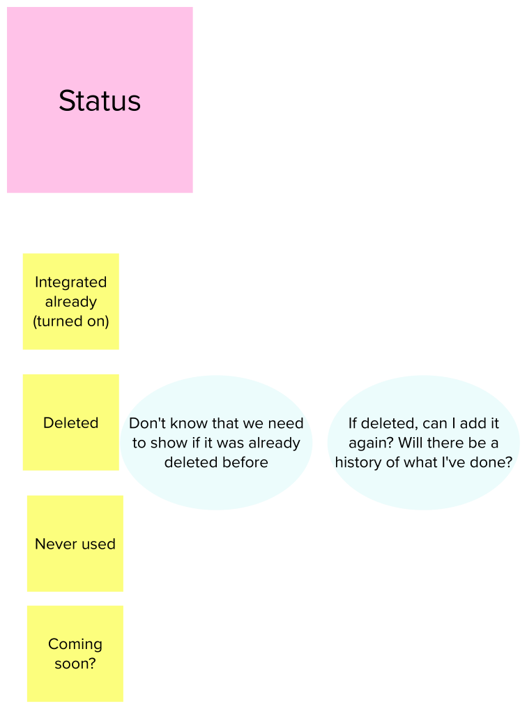
Tanya can tell which integrations she’s currently enabled.
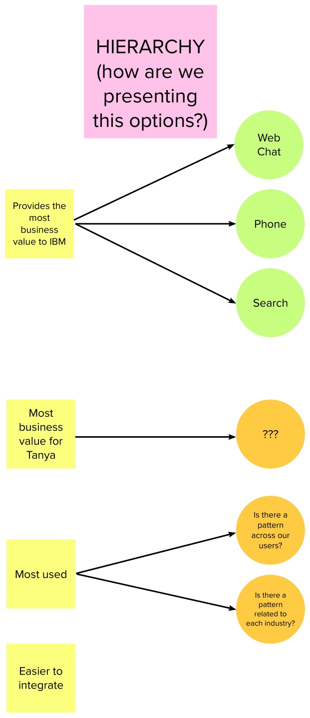
From a business perspective, to emphasize integrations that provide the most business value to IBM.
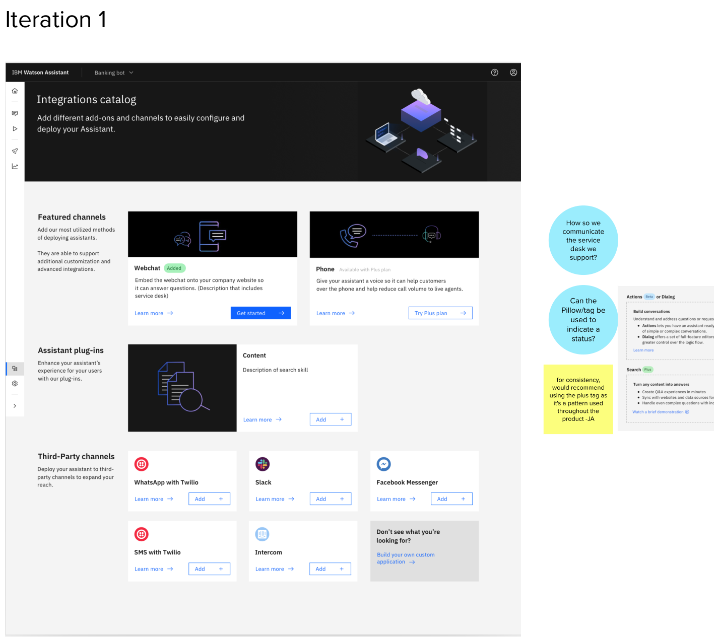
How it works (old experience)
Understanding what we’re solving for
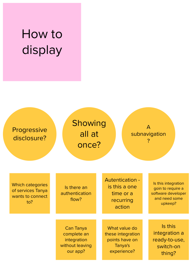
Initial explorations
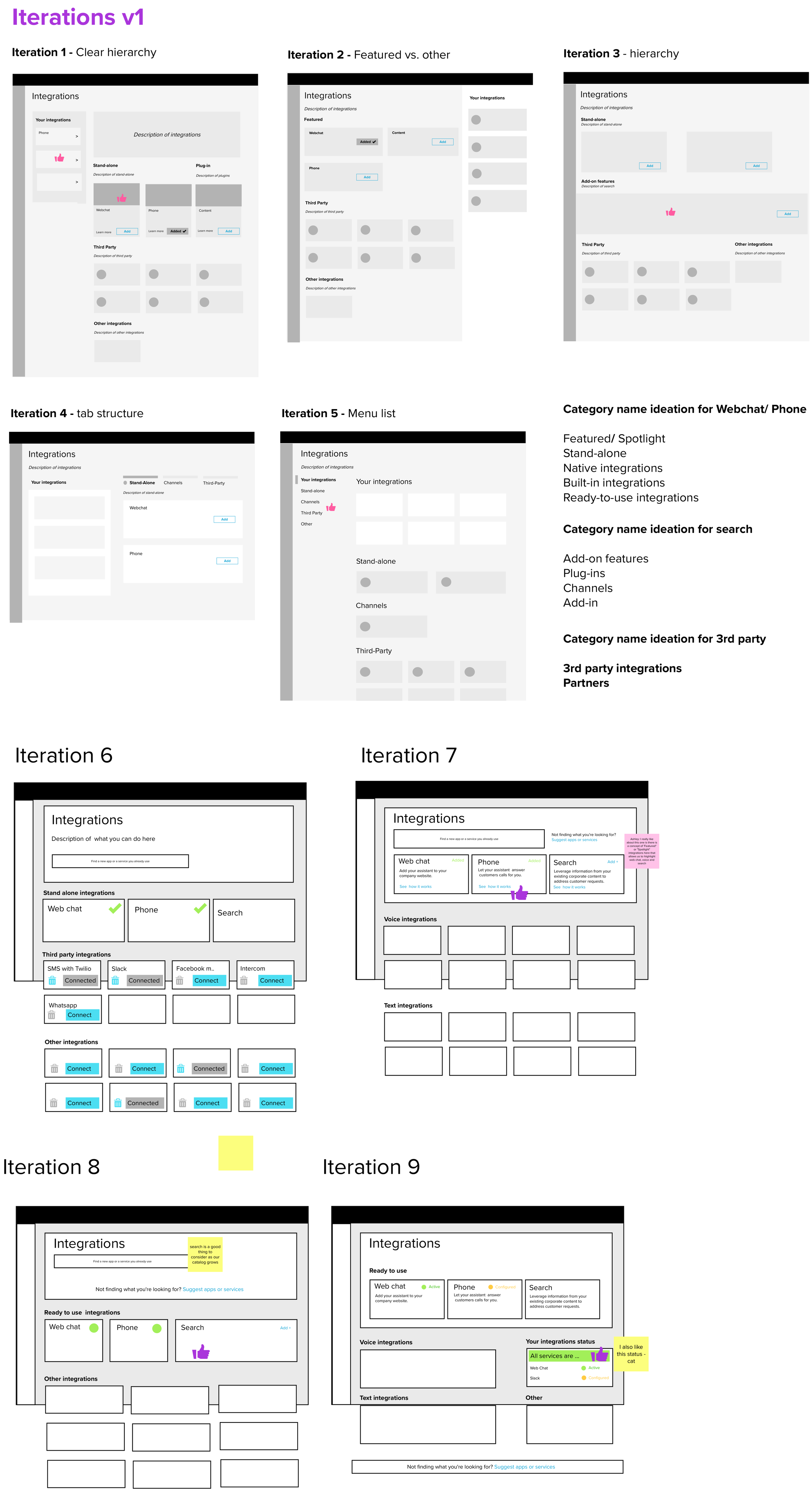
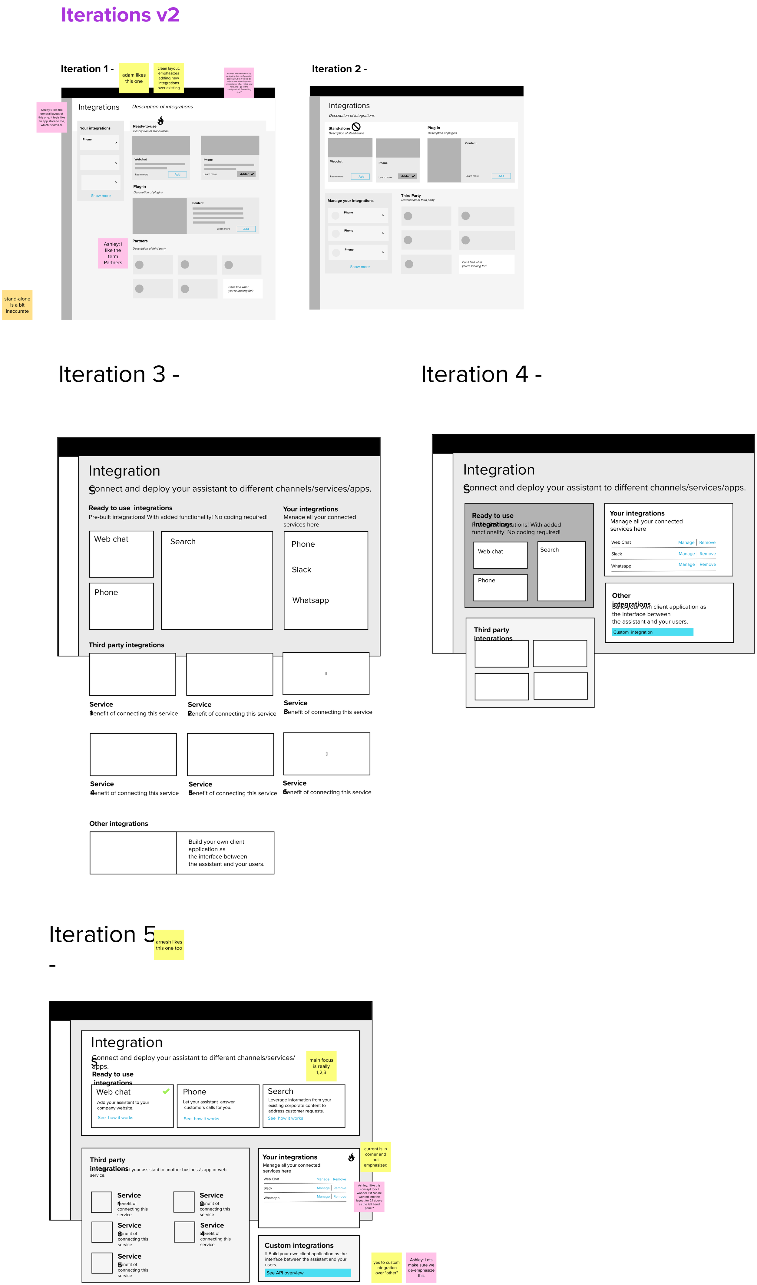
Further explorations
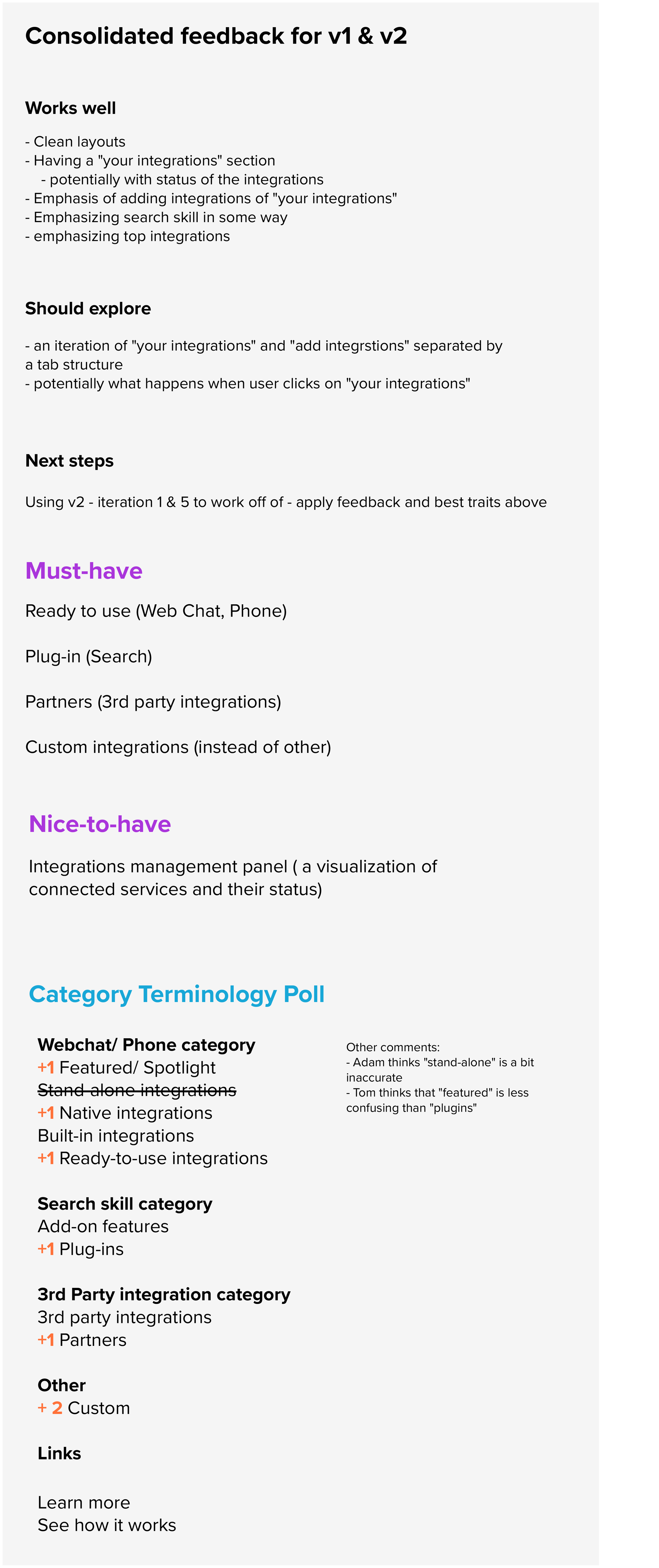
Key findings
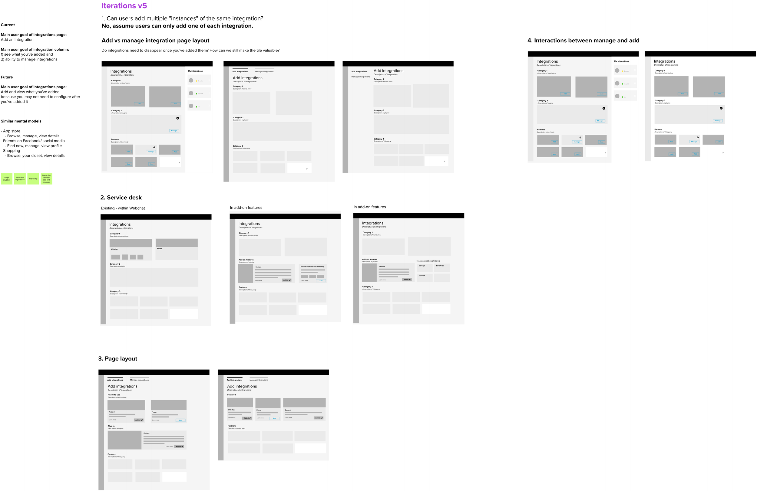
The Integrations Catalogue page should be a marketplace where Tanya goes looking for services and apps to enhance her Assistant.
We needed to think of Tanya’s mental model when navigating the Integrations Catalogue and explore similar mental models such as the App Store (browse, manage, view details), Friends on Facebook/ social media (find new, manage, view profile) and/or Shopping (browse, your closet, view details).
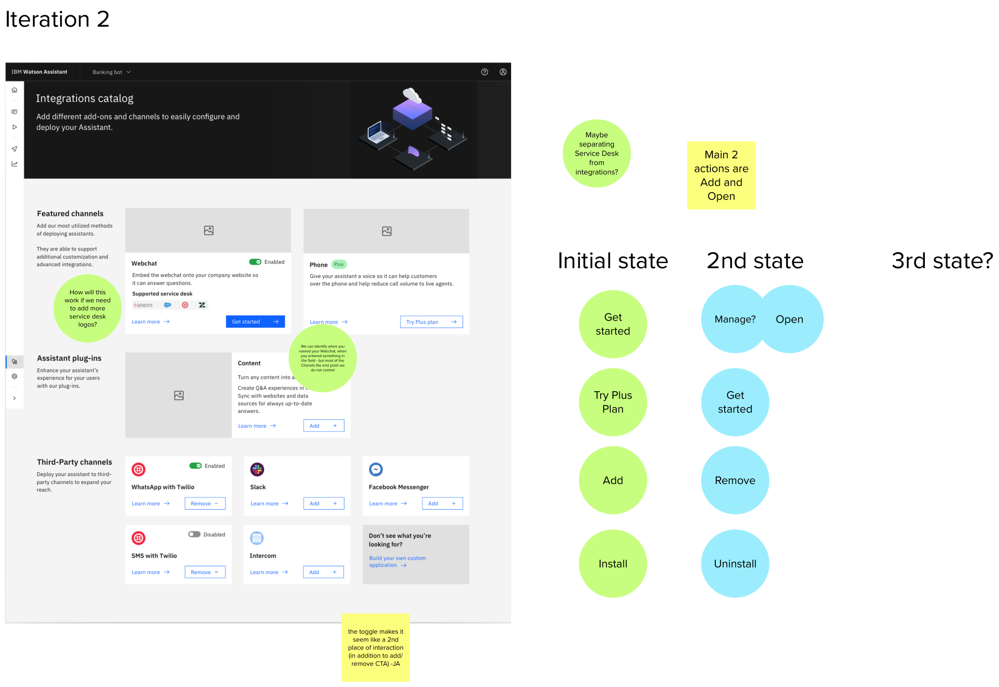
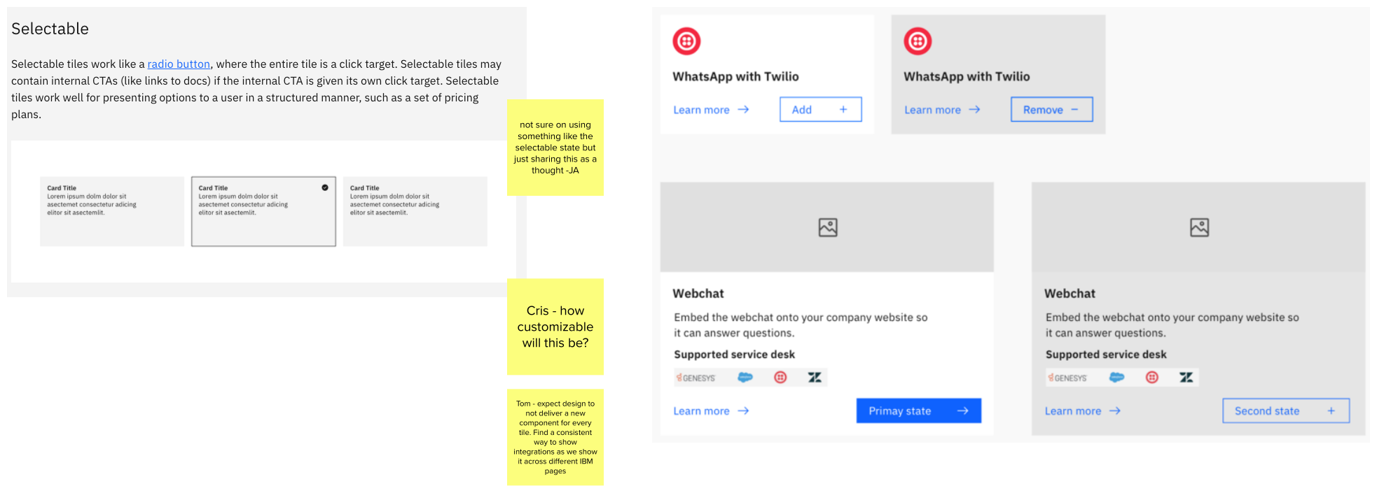
The primary action we wanted Tanya to accomplish on this page is to add integrations. We needed a way to communicate to Tanya the different states of her integrations: added, not added, added but need to upgrade plan to be available.
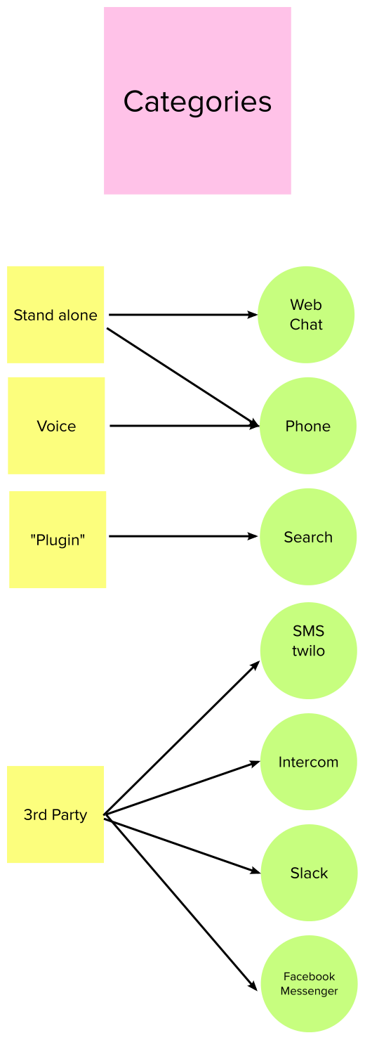
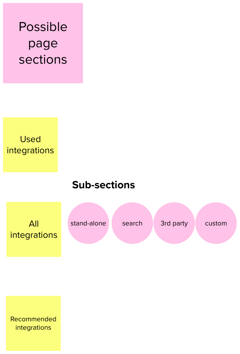
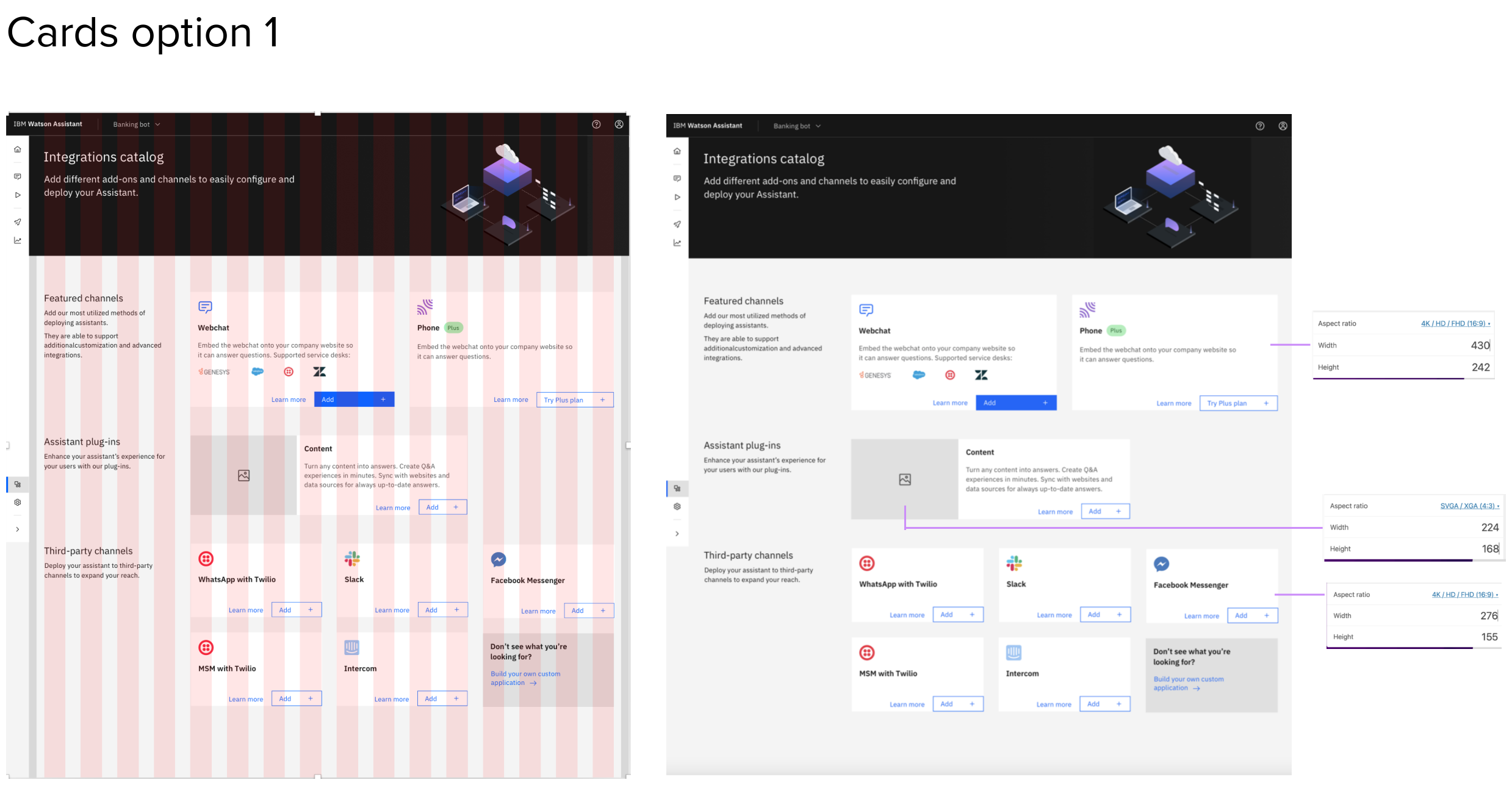
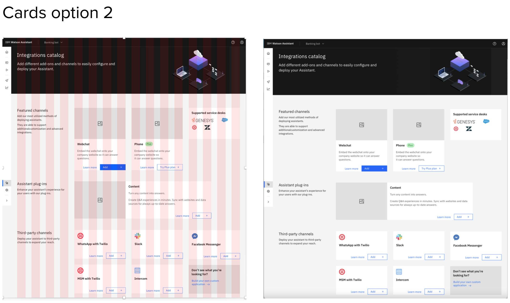
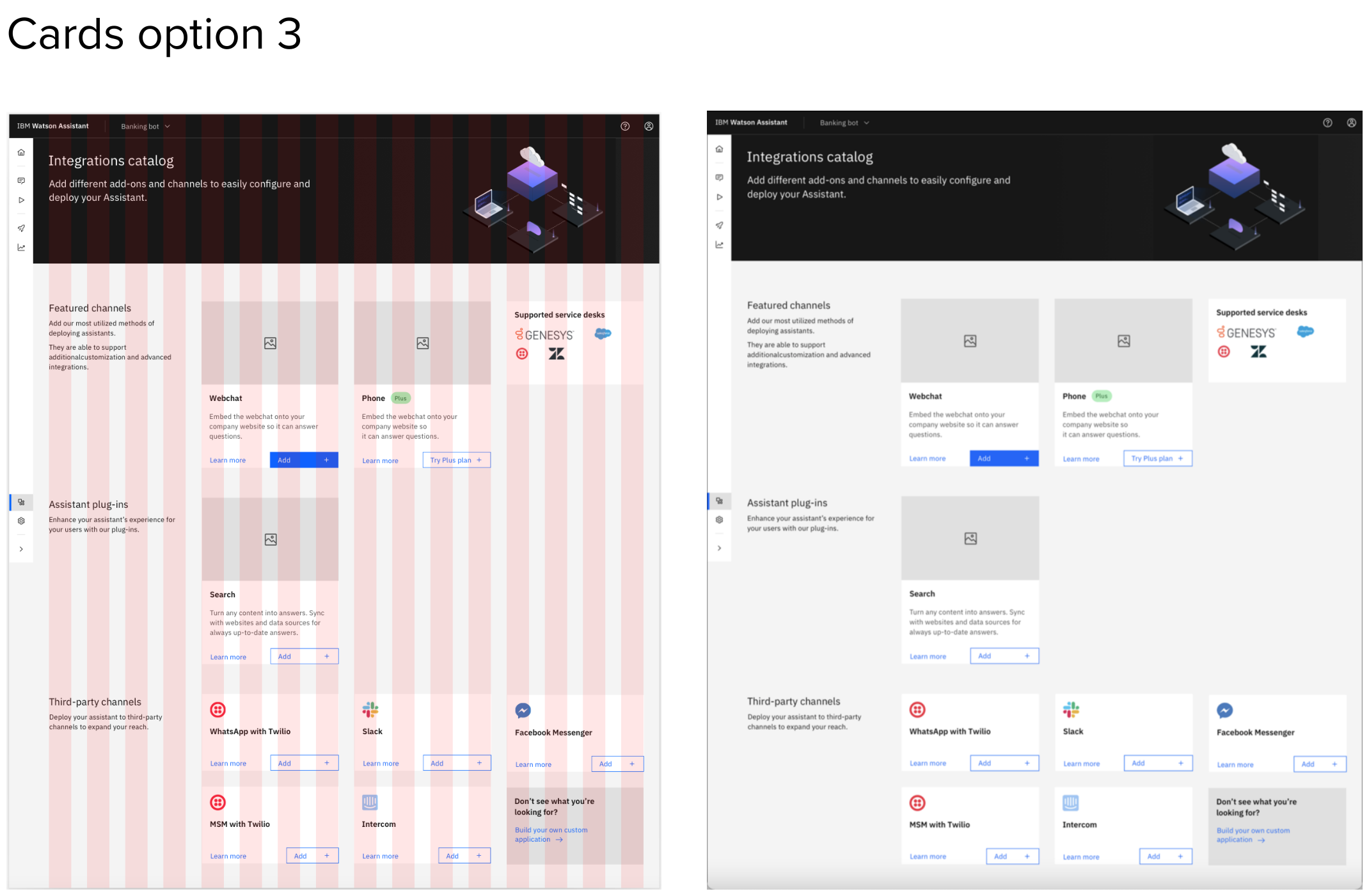
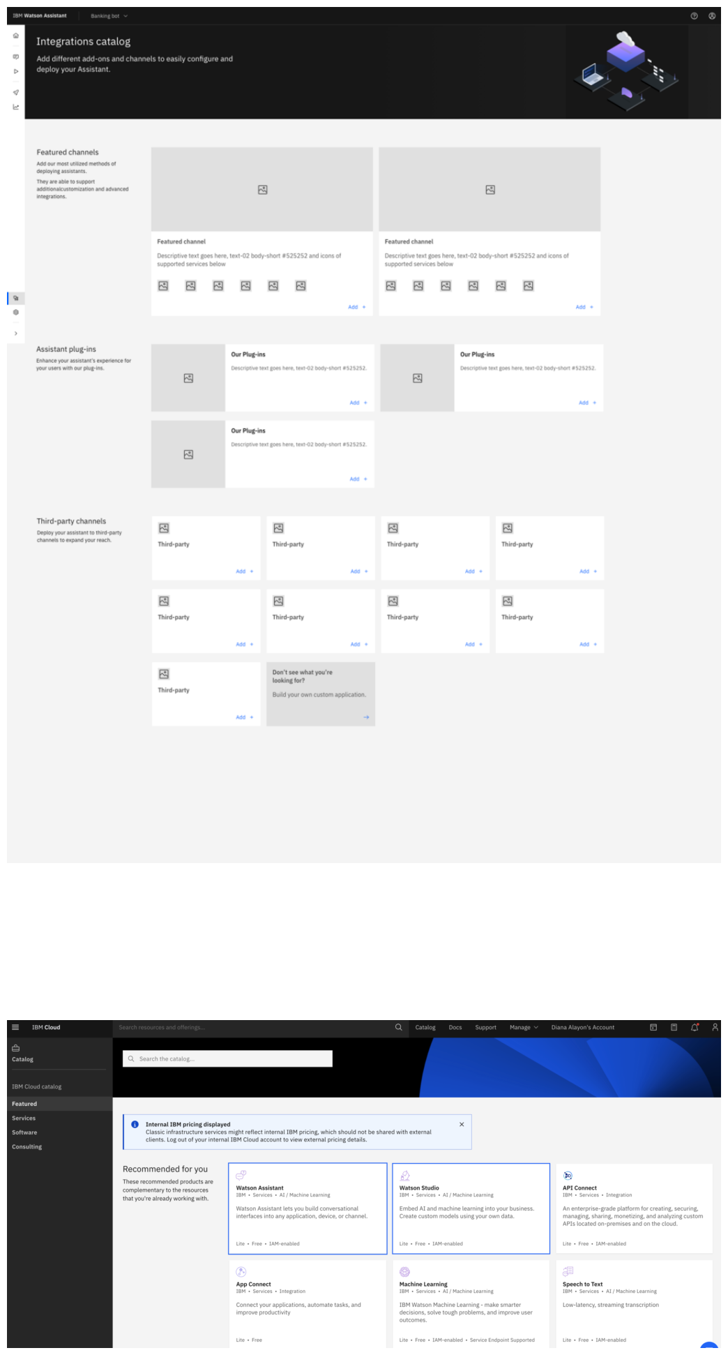
Exploring categories card options in the new layout
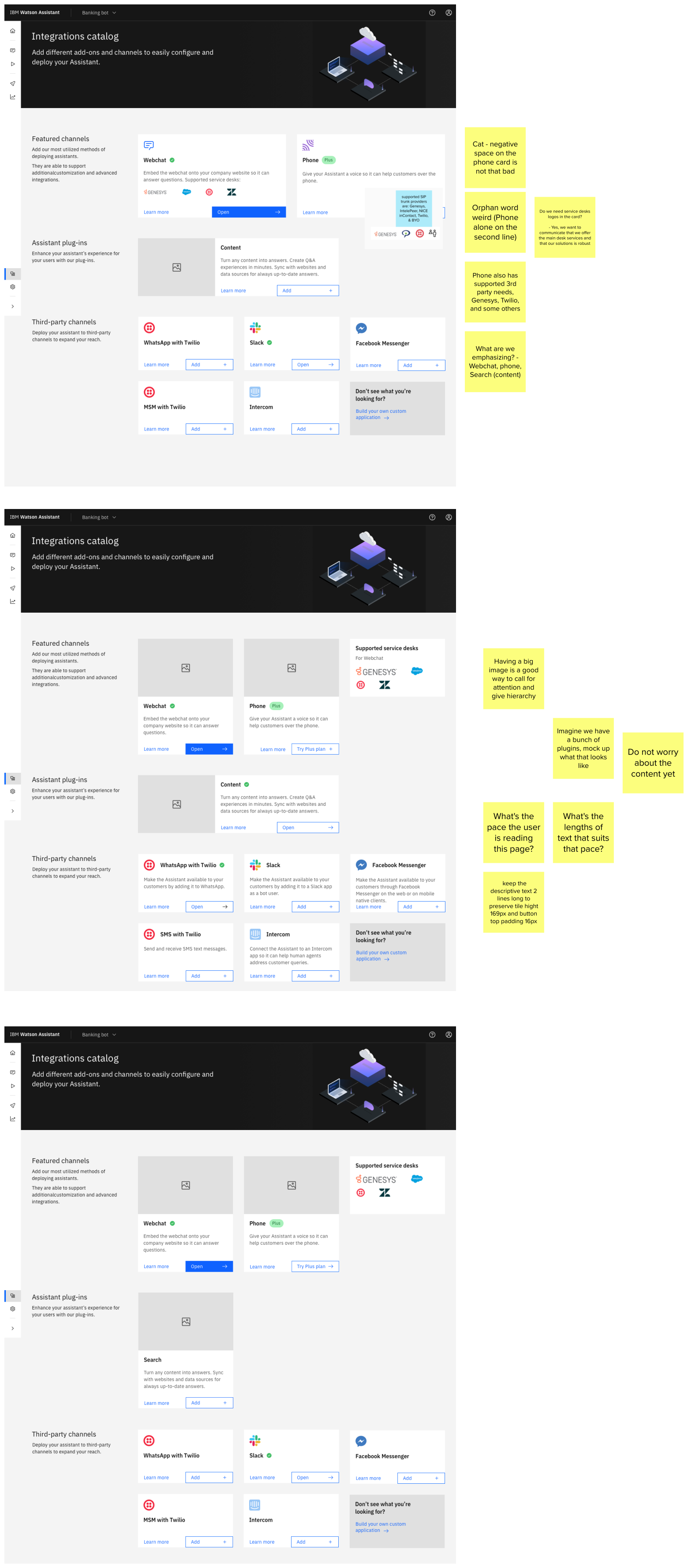
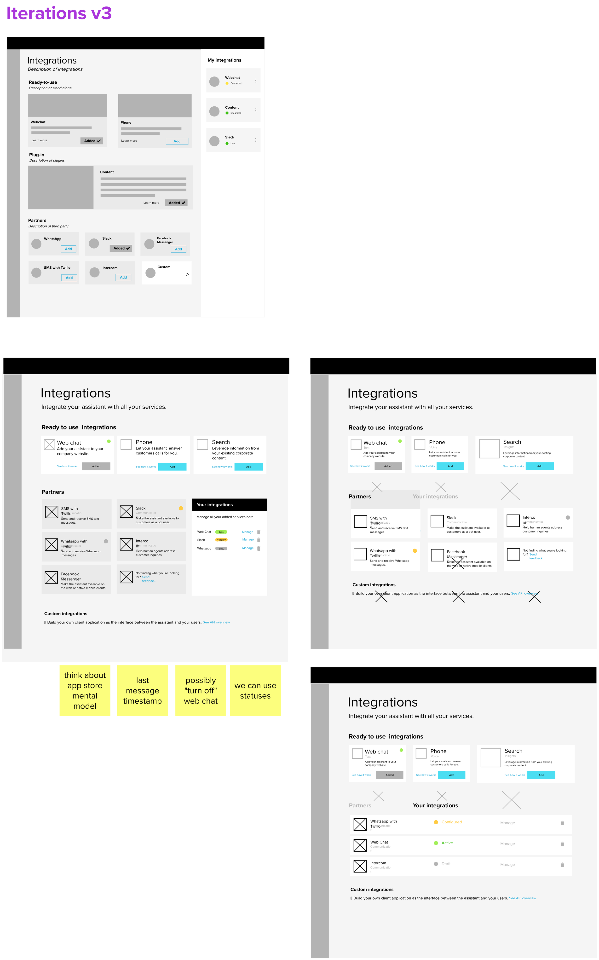
The outcome
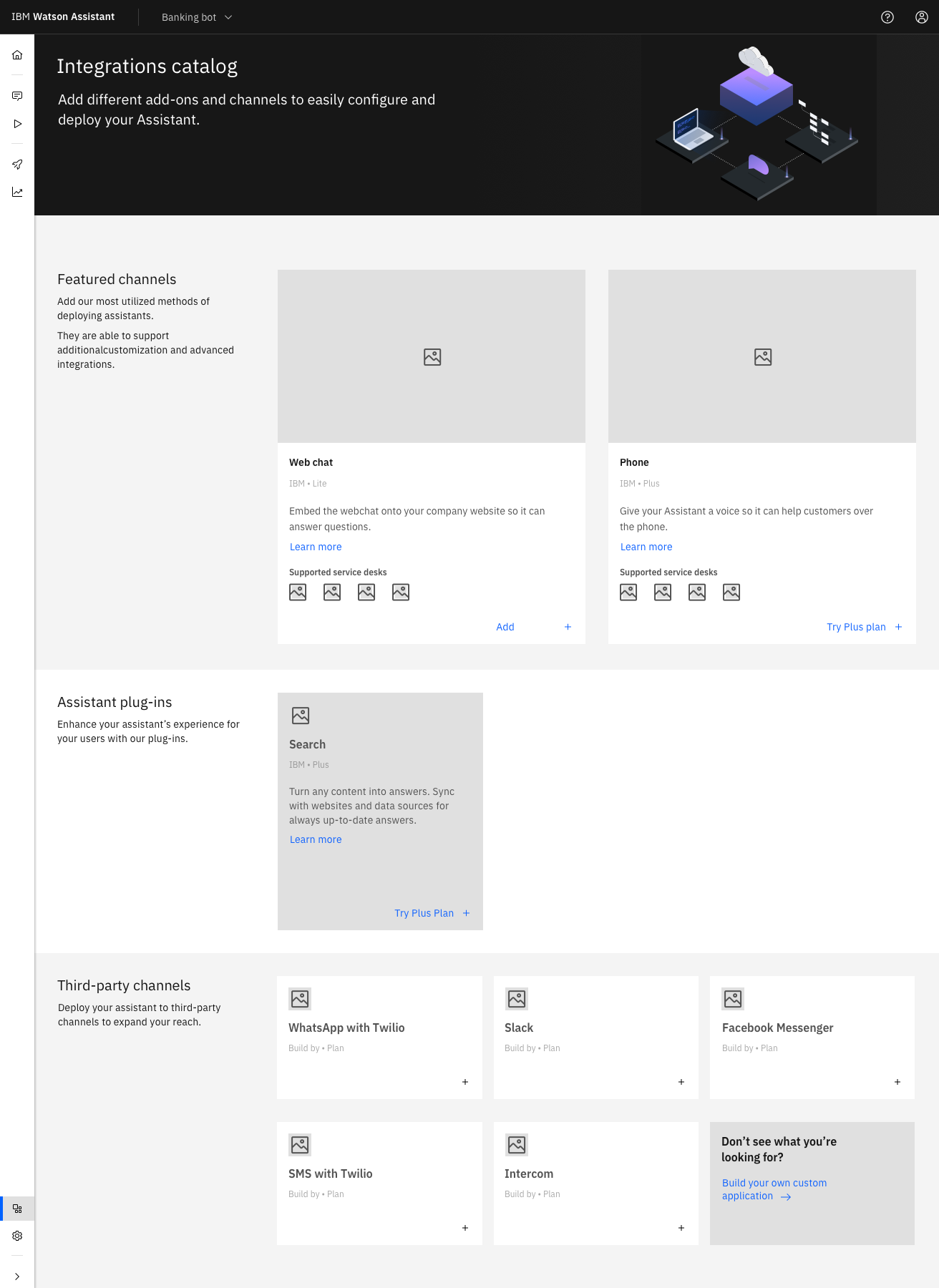
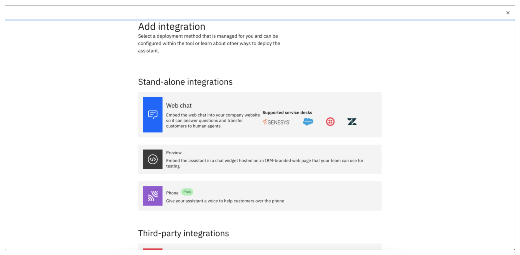
First, emphasized the channels that provide more benefits to Tanya when deploying her Assistant by showing them first and bigger: web chat and phone.
Second, we aimed to communicate to Tanya the difference between channels (where your users interact with your virtual Assistant) vs. plug-ins (what you can add to enhance the way your virtual Assistant responds to your customers).
Third, we’ve created 4 sections to communicate with intention:
The header, with the page title and a short description of “this is what you can do here”.
Featured channels, the ones that are built by IBM, are ready-to-use or require little work from Tanya to connect her assistant to.
Assistant plug-ins, offering the one available built by IBM but considering the addition of new plug-ins to the catalog in the future.
Third-party channels are the ones that are not built by IBM but are most commonly used by Tanya.
Last but not least, the cards. Despite their differences in size and layout, they share common elements:
Name of service.
Icon or image representing what that particular service does.
Who built it and with what IBM Watson Assistant Plan is available.
A CTA (call to action) for Tanya to add as the primary action. It changes its label, reflecting the status of the integration.