
I am a frequent client of Pagliacci Pizza. I love the thin tossed crust and their variety of assorted mouth-watering ingredients. I had experienced the ordering process in-store, online, and now I am trying their App for the first time. My order is always a half and half pizza, this means two different flavors in the same pizza. While ordering online was a straight forward process, ordering a half and half pizza using the mobile App was really frustrating.
After 3 attempts I figure it out. Yes, I could have been able to get my pizza as I wanted but I could not escape the feeling of being dumb so I decided not to place an order. This App may be super clever but users might not get it. Let's help Pagliacci Pizza to stop confusing their users and start guiding them instead.
I would like to clarify that I am doing this for the sake of user experience, I did not participate in the design process of Pagliacci's mobile App, and I truly believe they deserve a second chance because their product, as well as their customer service, meet my expectations 100% of the time.
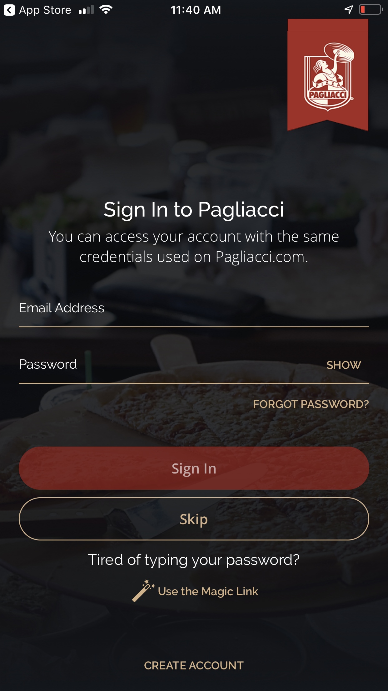
Creating an account
As a new user you are requested to create an account. A standard sign in form is presented asking for your e-mail address and password. If you do not wish to sign in now, you can skip this step and get to the menu options. However, you will be asked to create an account before checking out.
“Shop as a guest” would be a nice feature to have. I entered my e-mail, password, and tapped on “Sign In”.

Starting ordering
I successfully signed in and I notice a new screen with some features. I loved the "Welcome" followed by my name, makes me feel they care about me. There is a "hamburger menu" icon as expected on the top-left side, a Pagliacci icon indicating that I can locate the closest store to my location, really convenient.
What I found interesting was the "Redeem" call to action button. I have not seen this feature on their web site so I am considering to start ordering my pizzas with the mobile app. At the end of the day, who does not like to earn rewards, discounts or even a free pizza? I tapped on “Start New Order”.
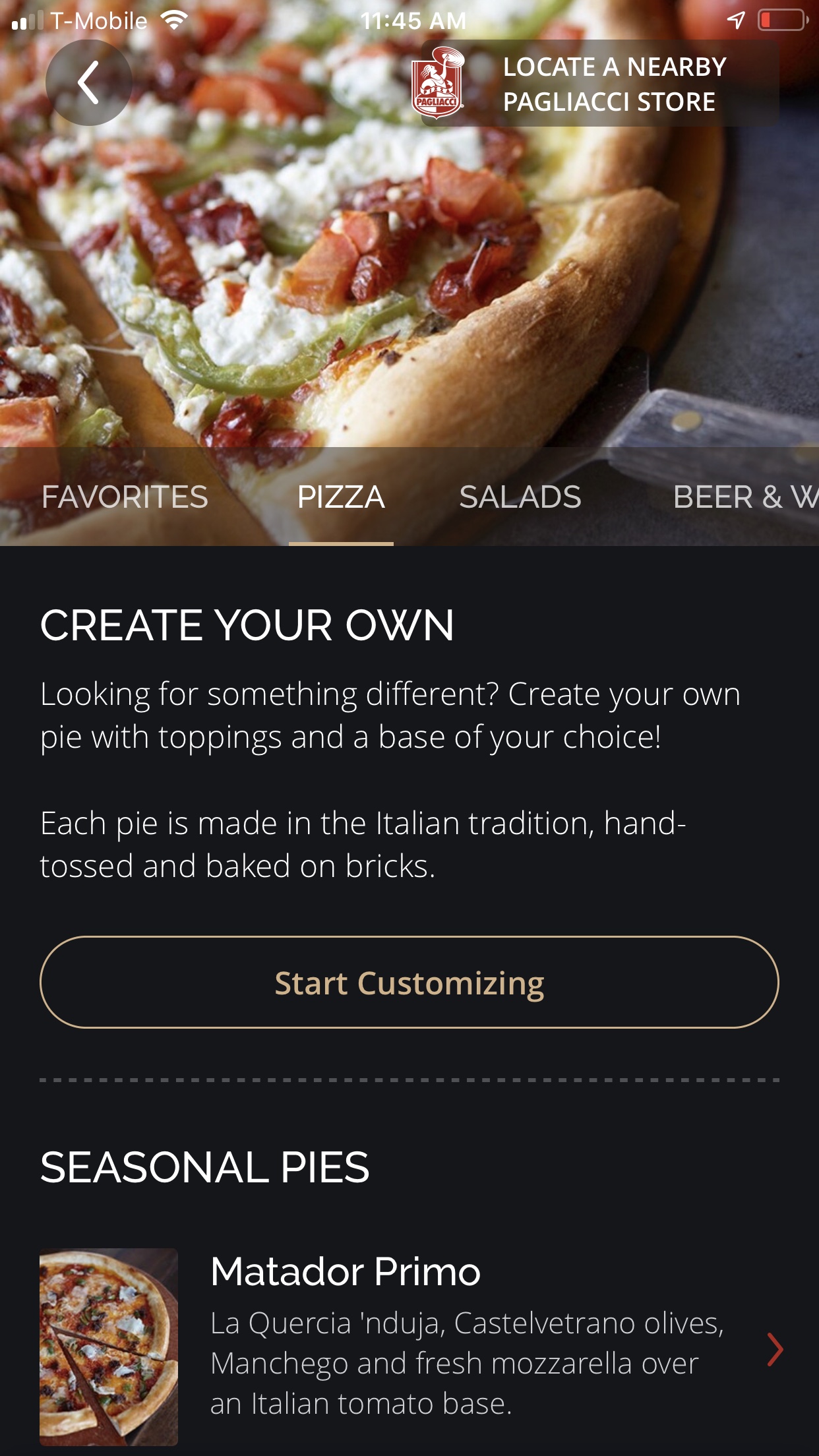
Creating my own pizza
When was presented with this headline "Create Your Own", honestly I did not go through the text but I noticed right the way the "Start Customizing" call to action button, and it resonated with what I was looking for. As I always go for a half and half pizza, I need to select two different flavors and this is customization. I tapped on “Start Customizing”.
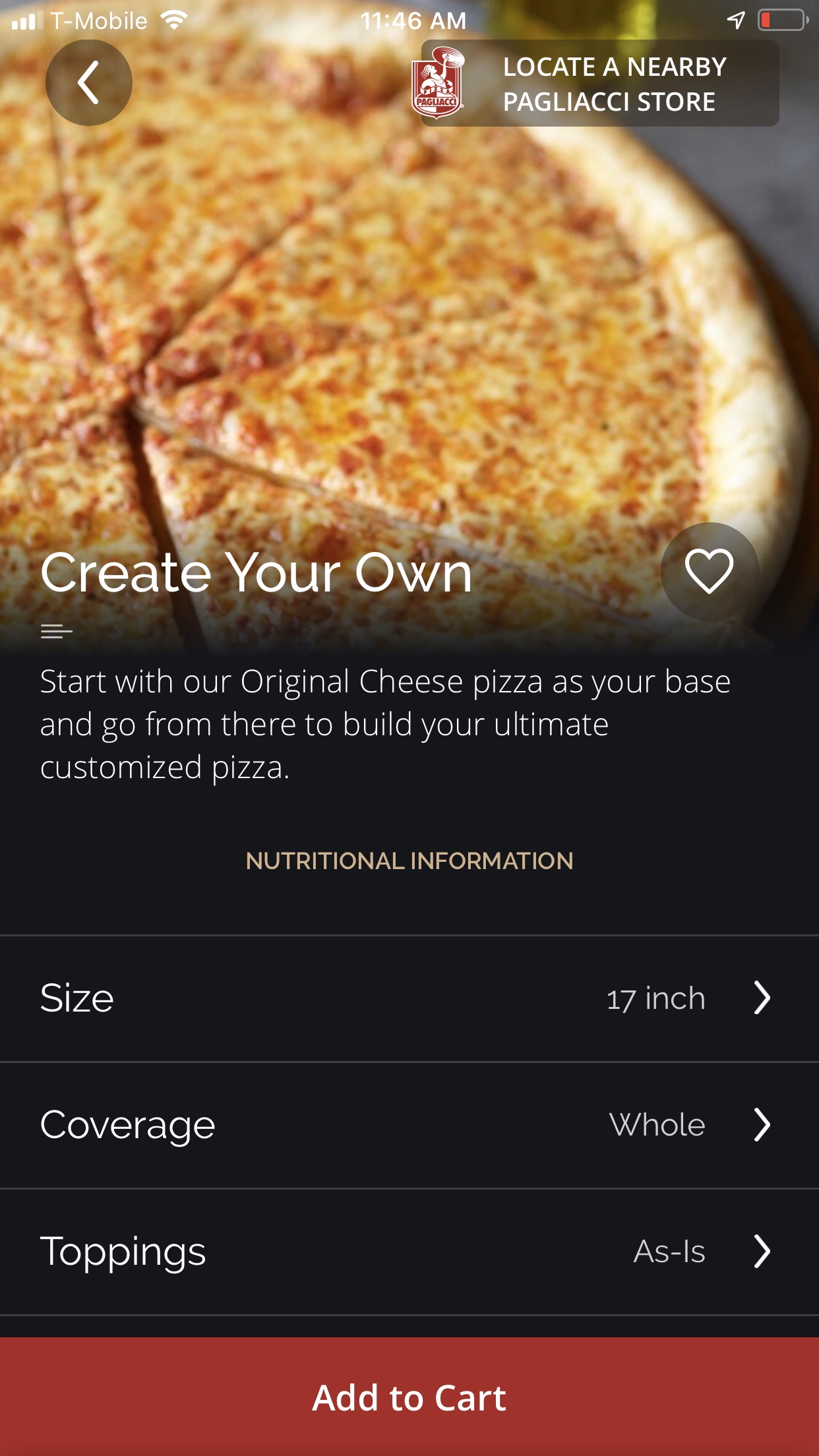
Relevant variables
Looks like I am going in the right direction. I am given the choice to select the size of my pizza, the coverage, and the toppings. All that I needed. The “Add to Cart” button is presented for the first time and it makes sense - having customized my order I would like to add it to my shopping cart, maybe I will add other items such as beverages and dessert but I want my pizza selection to be saved. I tapped on “Size”.

Toppings or basic ingredients?
There is no list of flavors or menu options like in their web site. Where is the Parma Primo and the Grand Salami Primo? My two favorites from their 29 pizza menu options. Instead, I was given three options that I perceive as basic ingredients in any pizza: Mozzarella, Oregano, and Pizza Sauce Base. If as part of the toppings there were a variety of cheeses such as Feta, Ricotta, and Gouda, or a variety of sauce bases besides Tomato, this would make sense to me.
Then I see the “Add More Toppings” CTA button and I tap on it. Indeed there are lots more topping options. So far I had not succeeded in finding the Parma Primo and the Grand Salami Primo for my half and half pizza.
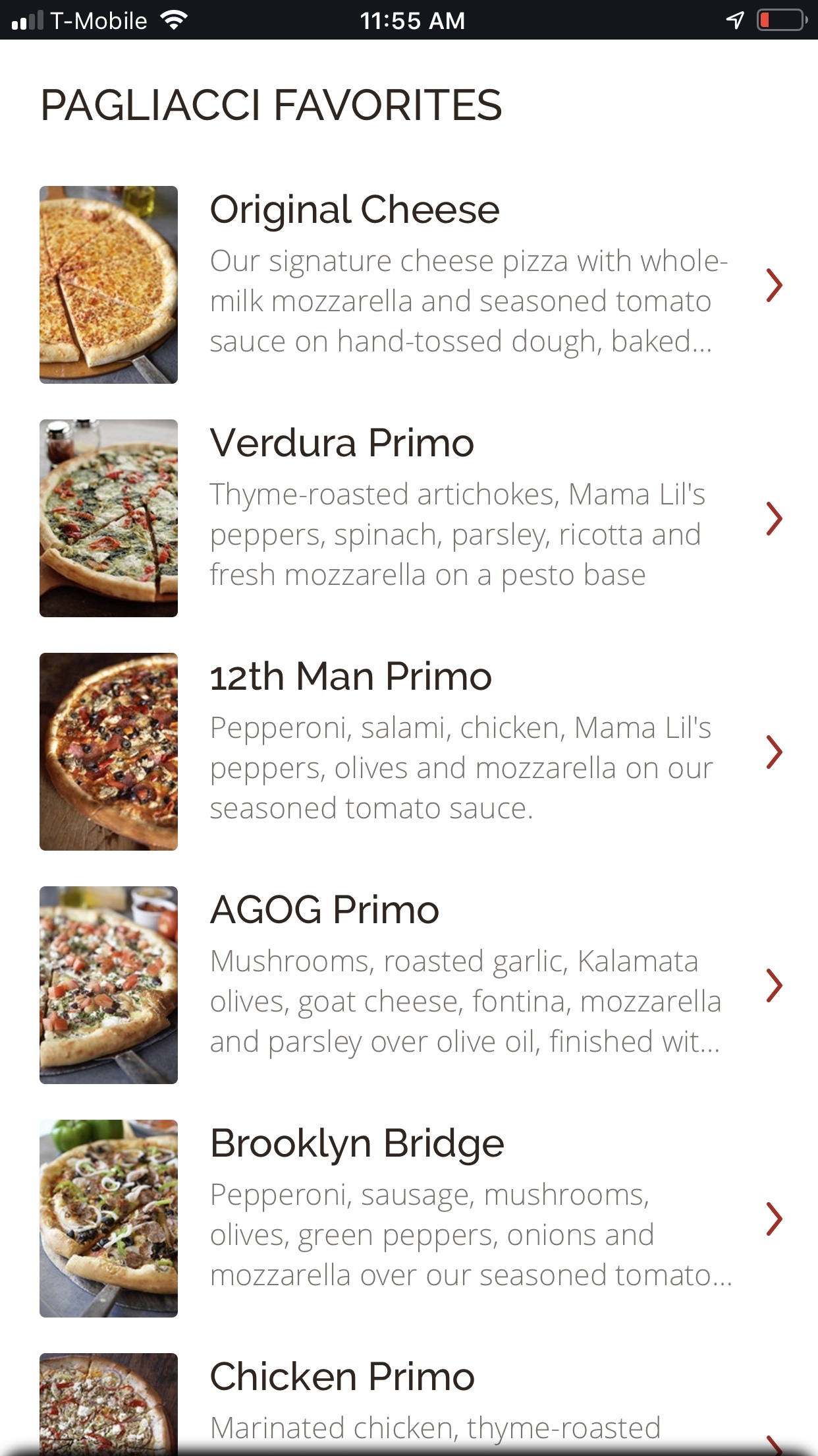
The Menu
Finally I got to the menu options. I did not bother to look for my favorite flavors as I was already lost in the process. I decided to tap randomly on any flavor and see what was about to happen. I picked the “12th Man Primo”.
To my surprise, I was presented the same screen I saw in the beginning when customizing the first half.

Second time around
I am not getting that pizza Today, sorry but I am frustrated. All I want to do now is to understand where did it all go wrong and how can I avoid this in the future.

Let’s get to the point
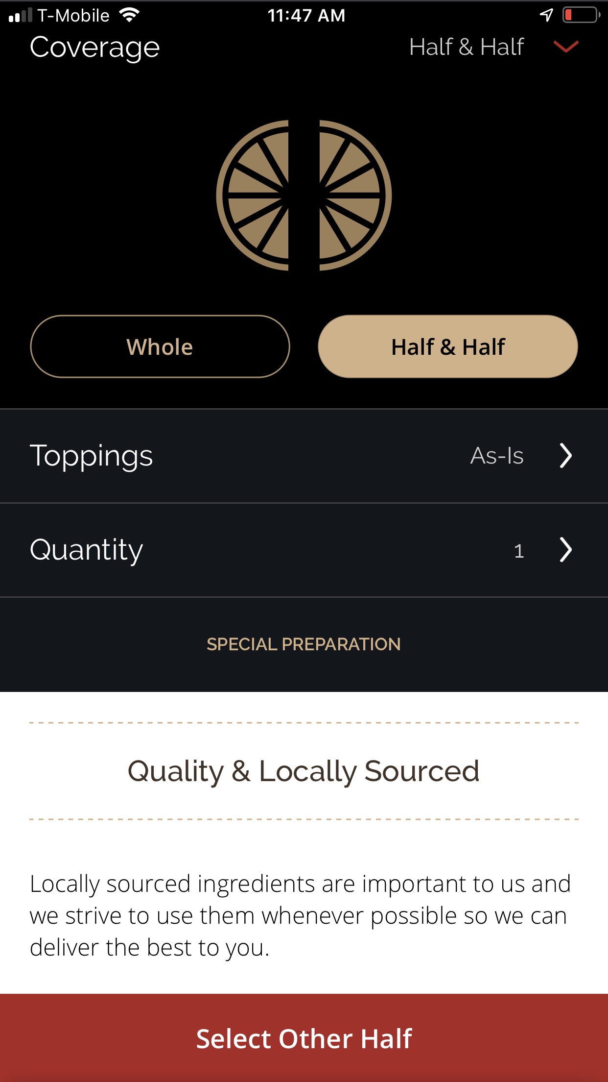
I tapped on “Coverage” and selected the “Half & Half” option. I decided not to add any toppings as I already have one nice flavor selected, with its own ingredients. After all, my previous experience using this feature was nothing but confusing.
A call to action “Select Other Half” was presented right the way. This is just what I was trying to do so I tapped on it.
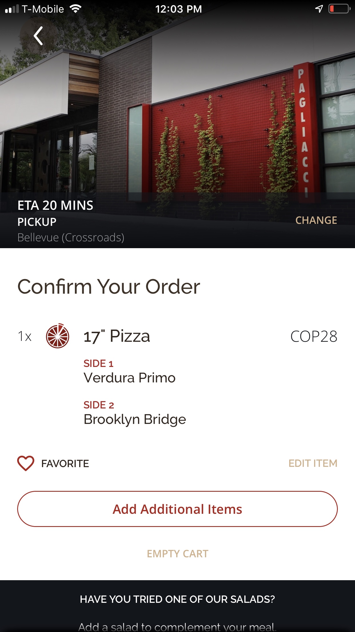
My order looks good!
I am finally here. I successfully added a 17 inches pizza, half "Verdura Primo”, half “Brooklyn Bridge”. I really liked that I can save it as favorite and this will allow me to repeat this order in the future. I also appreciate it shows the ETA, estimated time for my order to be ready for pick up.
Giving the option to add items or edit items this far of the process is really thoughtful, making it flexible for the user as you may change your mind at last minute.
The following step was the check out process. As I mentioned before, I decided not to order so I did not go through this process.
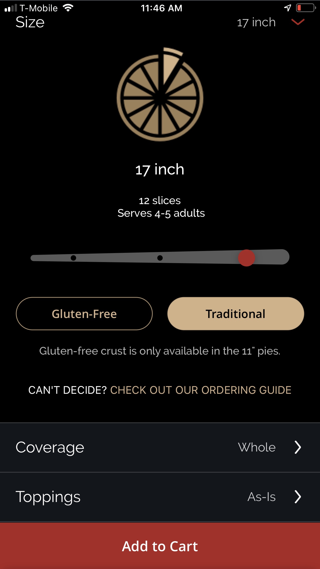
Choosing the size
Looks like I am going in the right direction. I am given the choice to select the size of my pizza, the coverage, and the toppings. All that I needed. I was having a hard time translating the size in inches vs. the number of people this pizza was going to be shared with. The pizza illustration took this worry away as it was easy to understand how many slices I will get according to the size selected. Plus, the text about slices vs. servings made it clear enough.
There is a slider with three spots so I understood there are only 3 sizes available. I wonder why they decided to use a slider if there are no values in between? It looks nice, it works, but maybe the metaphor of a slider is not applicable in this scenario. I have seen that sliders work best when the specific value does not matter to the user, for example graduating the temperature in your car or the brightness of an image in Photoshop.
The “Add to Cart” button is presented for the first time and it makes sense - having customized my order I would like to add it to my shopping cart, maybe I will add other items such as beverages and dessert but I want my pizza selection to be saved. I tapped on “Size”.
Time to select the other half
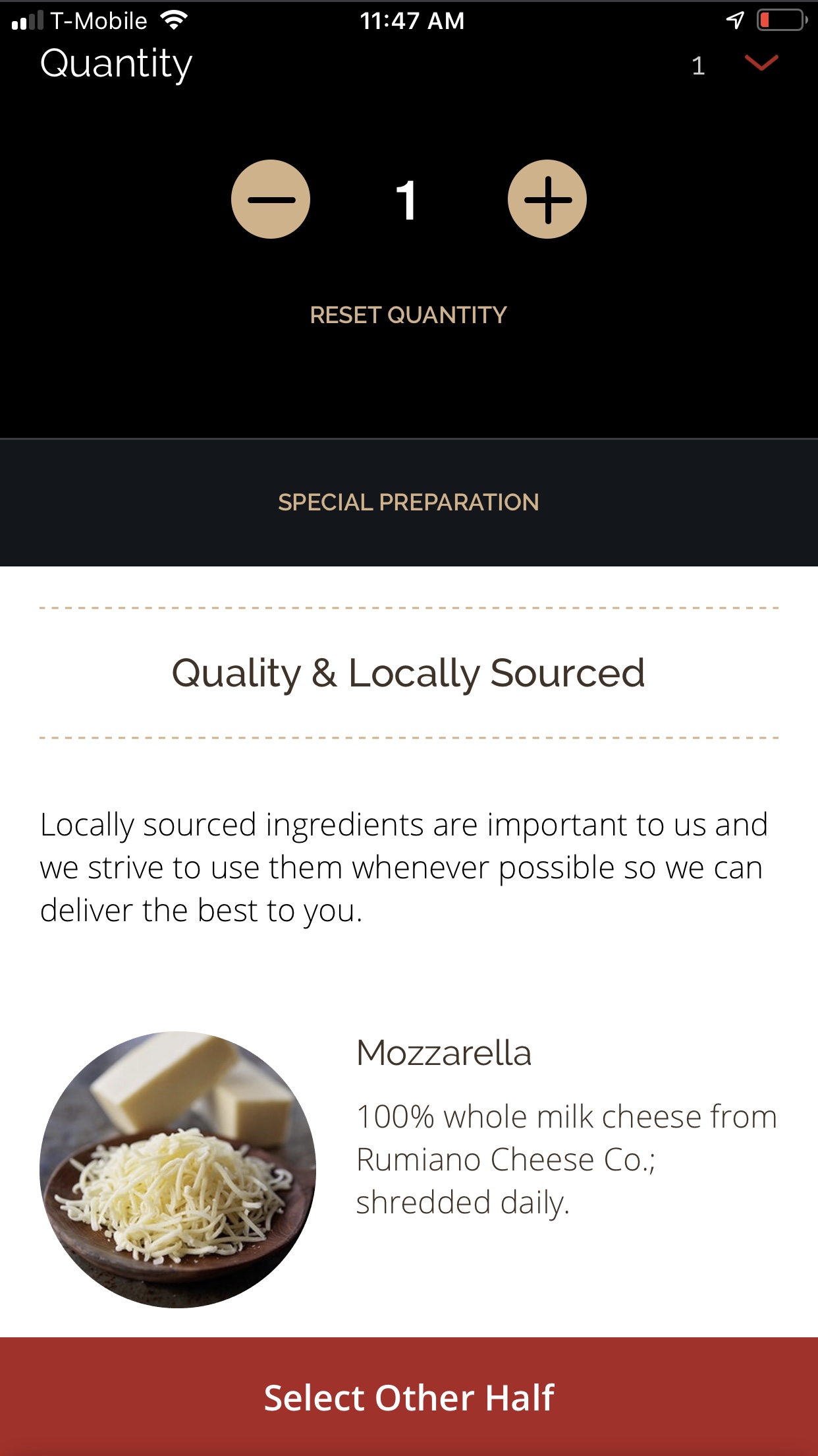
I am ordering one pizza only and number 1 auto-populates in the “Quantity” field, perfect. I tapped on it just for curiosity to see how you would add or subtract quantities from your order and this is a straight forward process.
Aligned to the bottom of the screen I saw a button labeled “Select Other Half”. Just then, I realized I was not on the right path. I was given the option to select the other half of my pizza when I have not even selected the flavor I wanted for the first half. I tapped on it.

Back to the start
Having selected the size of my pizza, the half and half option instead of the whole option, and some toppings, I wonder why I am presented the same exact screen twice when all I wanted was to pick a flavor for the second half of my pizza. At this point I was really confused so I decided to tap on “Add to Cart” and see what items have been added to my shopping cart.
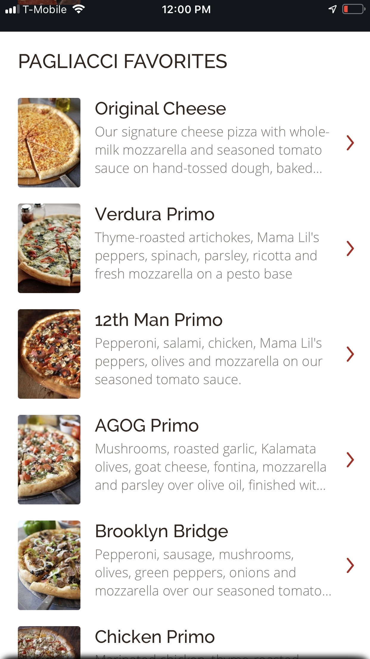
Straight to the menu
In my first attempt, I was fooled by the “Create Your Own” heading and the “Start Customizing” CTA button. This time around I went directly to the menu. I was not looking for my two favorite options as I decided not to order. Flavors were selected randomly.

Back to menu for the second flavor
It takes me back to the menu screen, where you need to swipe up to see all the options from the menu (just like the screen above, with white background). I randomly selected the “Brooklyn Bridge” flavor.
Choosing the flavors for each half of my pizza
Finally here! I can select “Whole” or “Half & Half” and it is clear how the illustration of the pizza changes depending on the option selected. Now that I have selected “Half & Half”, I tapped on “Toppings” expecting to find a list of flavors to choose from for my first half.

Wait, I’ve been here before
I decided to move on with the frustration of not finding my two favorite flavors and so far being unable to customize my pizza. Having tapped on “Select Other Half” brought me to the exact same screen that was presented to me at the very beginning of the process of “Start Customizing”.
Now I wonder if I am starting the order from scratch if everything that I have done so far was not saved. Why? I never received a notification stating that I was done customizing the first half. I am thinking of that pizza illustration with the slices and the pizza cut in half and wishing this was presented to me again, reflecting that some changes have been applied to one of the halves. I swipe up and down, and discovered the menu options.

My order is completely wrong
Keep in mind all I was trying to get was one 17inch pizza, half Parma Primo, and half Grand Salami Primo. My purchase decision was made long ago and somehow this was meant to be a simple task. And so far, I added to my cart two 17 inches pizzas: one half and half pizza, each half has the same flavor “Original Cheese” which I do not recall selecting, and a whole pizza of “12 Man Primo”.
Not what I wanted. But I still want my pizza, so I tapped on “Empty Cart” and start all over.
I realized how easy was to add the “12th Man Primo” to my cart, compared to the “Half & Half” option. Based on this, I decided to take a different path in my second attempt.

Relevant Variables
I can see by the image displayed above, the headline, and the text, that I successfully selected “Verdura Primo” as one of my two flavors. There were the size, coverage and topping options.
When I was about to select the size, I noticed there was a default option of 17 inches. Smart, if you do not tap on “Size” and check what other options do you have, most likely you will buy the pizza with the higher cost.

Consistency
I was able to select the flavor for the other half. I saw the same screen as when I picked the first flavor, it shows the picture of the flavor selected, the name of the flavor and a detailed description of the ingredients.
One nice thing to have could be information about my first-half selection, and my second-half selection. All together so I can have a clear understanding of what I’ve done, what I’m doing, and what I have to do next.
There is nothing indicating that I am working on the second half now, besides the fact that I was unable to change the coverage option. When I tapped on “Size” it let me change it. When I tapped on “Toppings”, it let me modify my options. But when I tapped on “Coverage”, I realized this option was no longer available, however, displayed in my screen. I tapped on “Add to Cart”.
Recommendations
Feedback on progress towards the goal:
As the pizza illustration shows the user the number of slices per size, that you are ordering a whole pizza or a half & half pizza, Pagliacci could show a change in the illustration as the user customize each half of the pie.
Be coherent with the process of ordering online vs. mobile:
As Pagliacci’s website was established prior to the mobile App, the users are already familiarized with the shopping experience online. Users expect the same level of simplicity, if not improved.
Review titles and labels:
Ordering a half and half pizza might be perceived as a customization process. The start customizing button in the app does not allow you to do so. An analysis of tasks such as create your own pizza, order a whole pizza, and order a half and half pizza might lead to better communication with the user.
Reconsider the use of a slider for selecting the size:
There are only 3 sizes. As there are no values in between, the metaphor of a slider is not applicable in this scenario. It could be just the 3 circles working as radio buttons, where only one option can be selected. It could also be a drop-down menu.