OATAG’s website redesign

Timeline: Ongoing project.
Deliverables: Research plan, research findings, usability recommendations, high fidelity mockups.
Design lead: Diana Alayon.
UX, visual, research: Diana Alayon.
OATAG website committee: Margaret DeLacey, Judi Smith , Bob Smith.
The problem
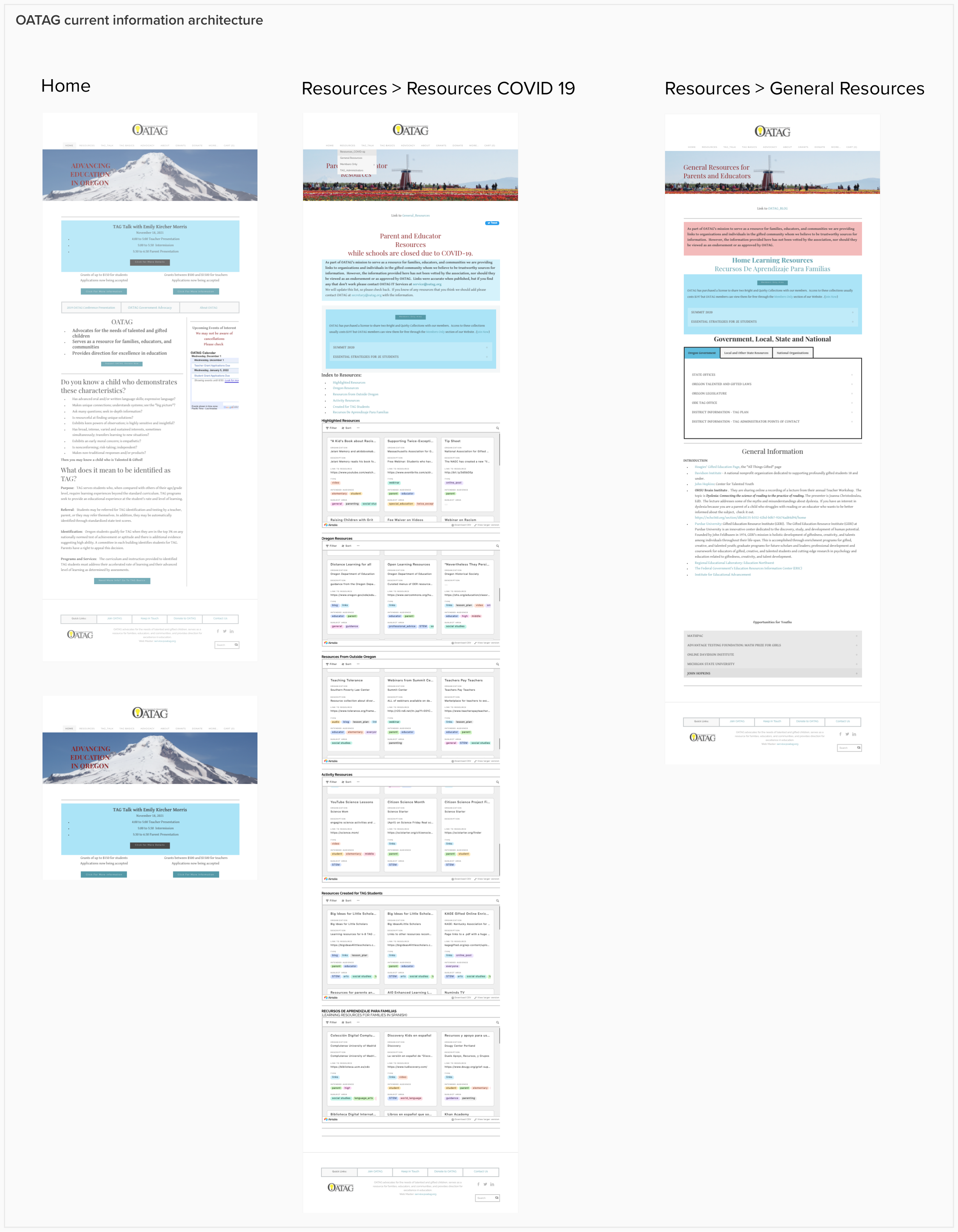
OATAG, the Oregon Association for Talented and Gifted, is a non-profit organization that advocates for students, parents, and educators. Their website offers useful and relevant resources related to the talented and gifted such as academic resources, free-online material, events, scholarships, and community.
However, good information without a clear path for users to find it defeated all the purposes of the website:
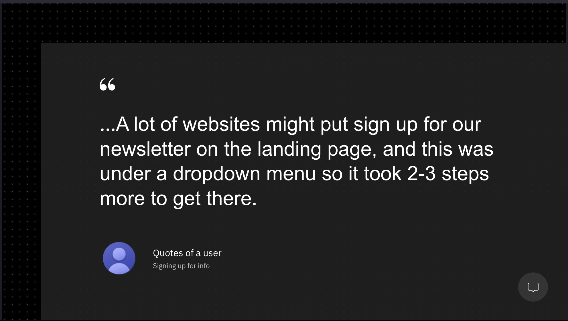
The site overwhelms/intimidates users with thick blocks of text and many links to go through when landing on the home page for the first time (it’s even hard for users familiar with the site).
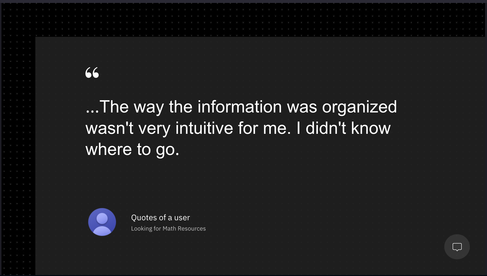
It wasn’t clear to the organization who the primary user of the website is: The parents? The educators? The students? This confusion was reflected in the website structure.
It wasn’t clear to the organization what users come to their website for, what they do here, and how.
The terminology used across different pages of the site is fueled with academic tag jargon, presenting a challenge for less literate audiences.
The goal
To understand what users come for to OATAG’s website.
To identify what pain-points users have when navigating OATAG’s website.
To understand the organization's goals for their website so that the new design is oriented to achieve just that.
To improve the findability of the resources available on the website, re-thinking the information architecture.
To establish clear call to actions (CTAs) we want users to complete on our site.
To re-structure the content so that users can skim and get the message across.
Current state
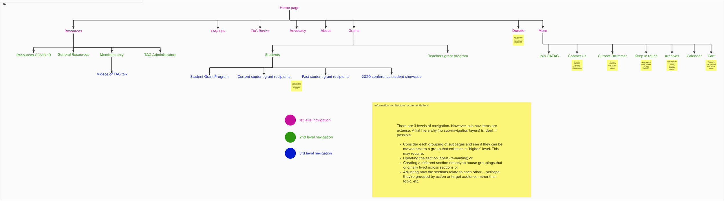
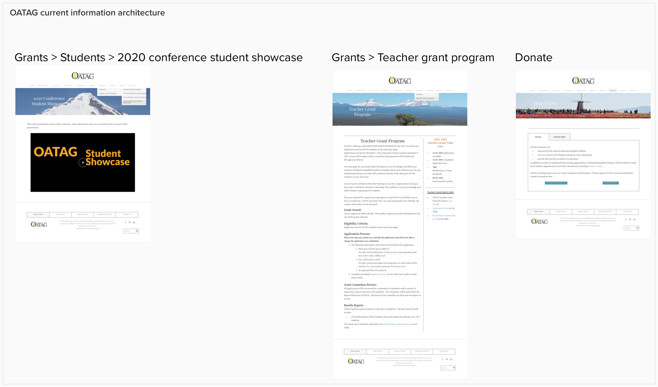
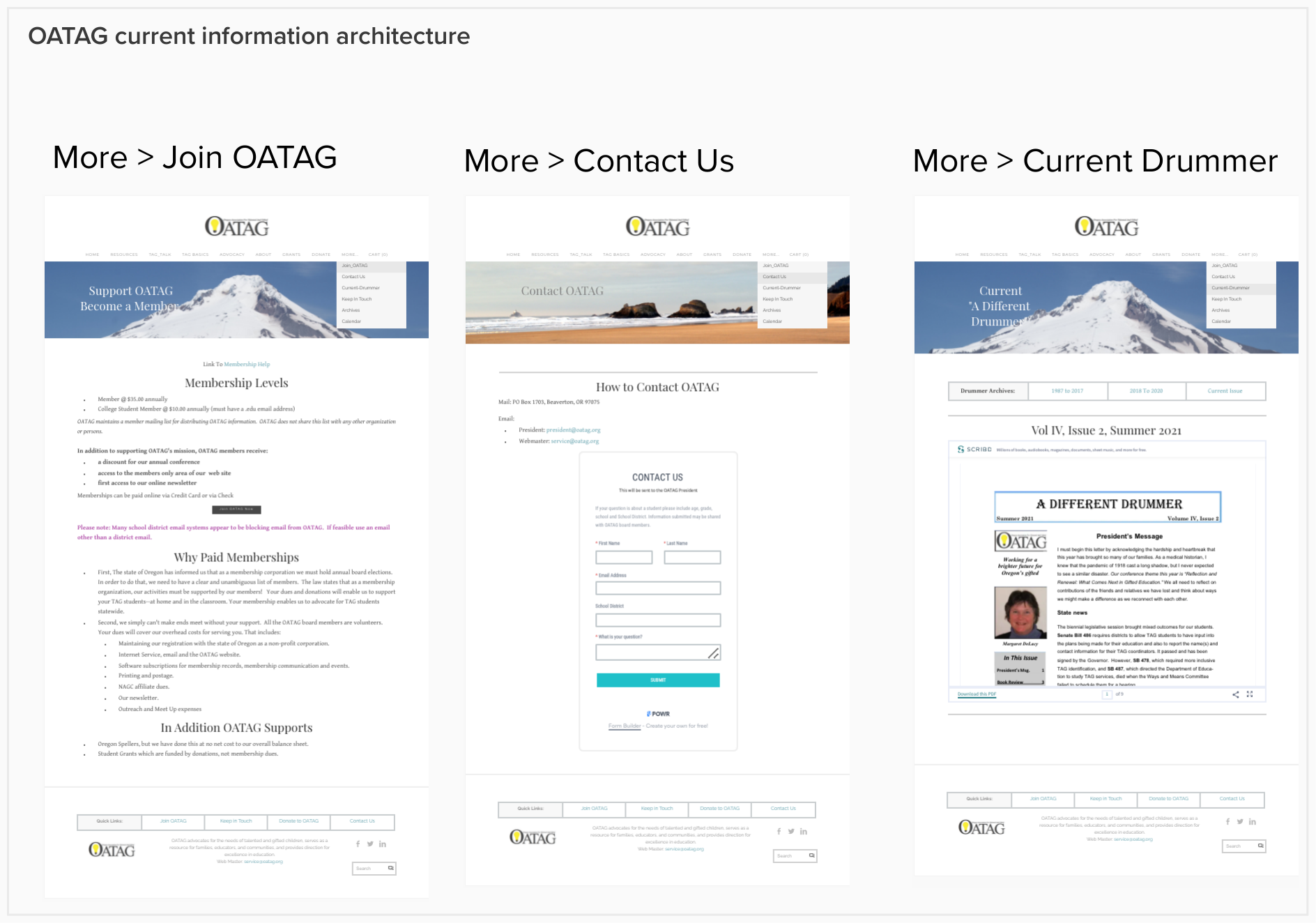
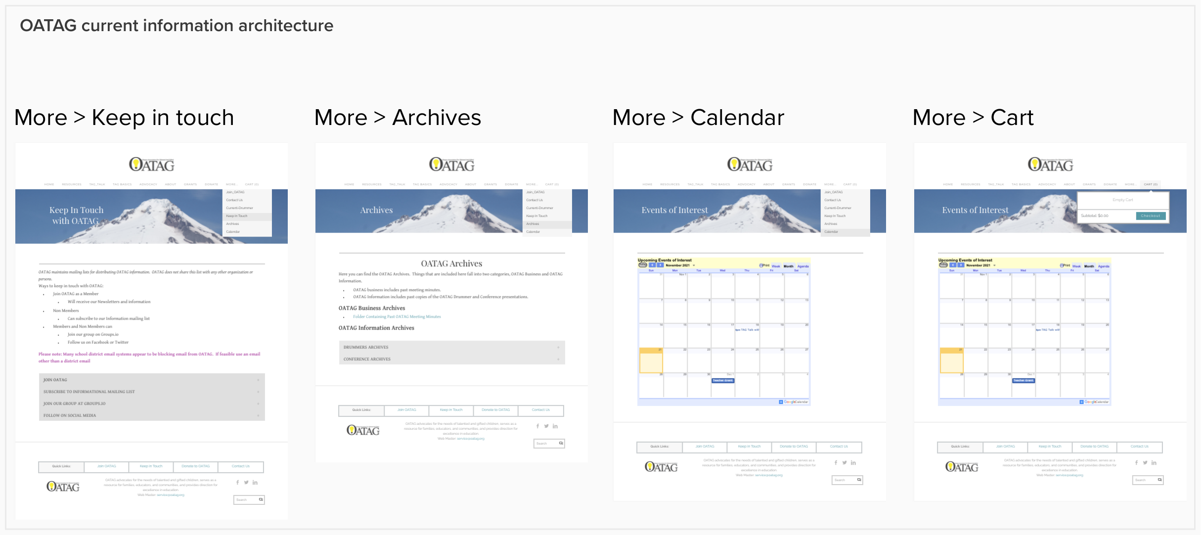
Having a view of all the pages helped me to visualize the site as a whole:
What’s the information architecture like.
How many levels of navigation are we presenting to users and how are we categorizing/grouping information.
How clear and unambiguous are the labels in navigation items, buttons, and CTAs (call to action) in general.
Making assumptions
I’m not an OATAG user, and at this point, I’ve not conducted interviews. From my exploration of the site, I’ve found pain-points users may be experiencing too when navigating the site:
Navigation
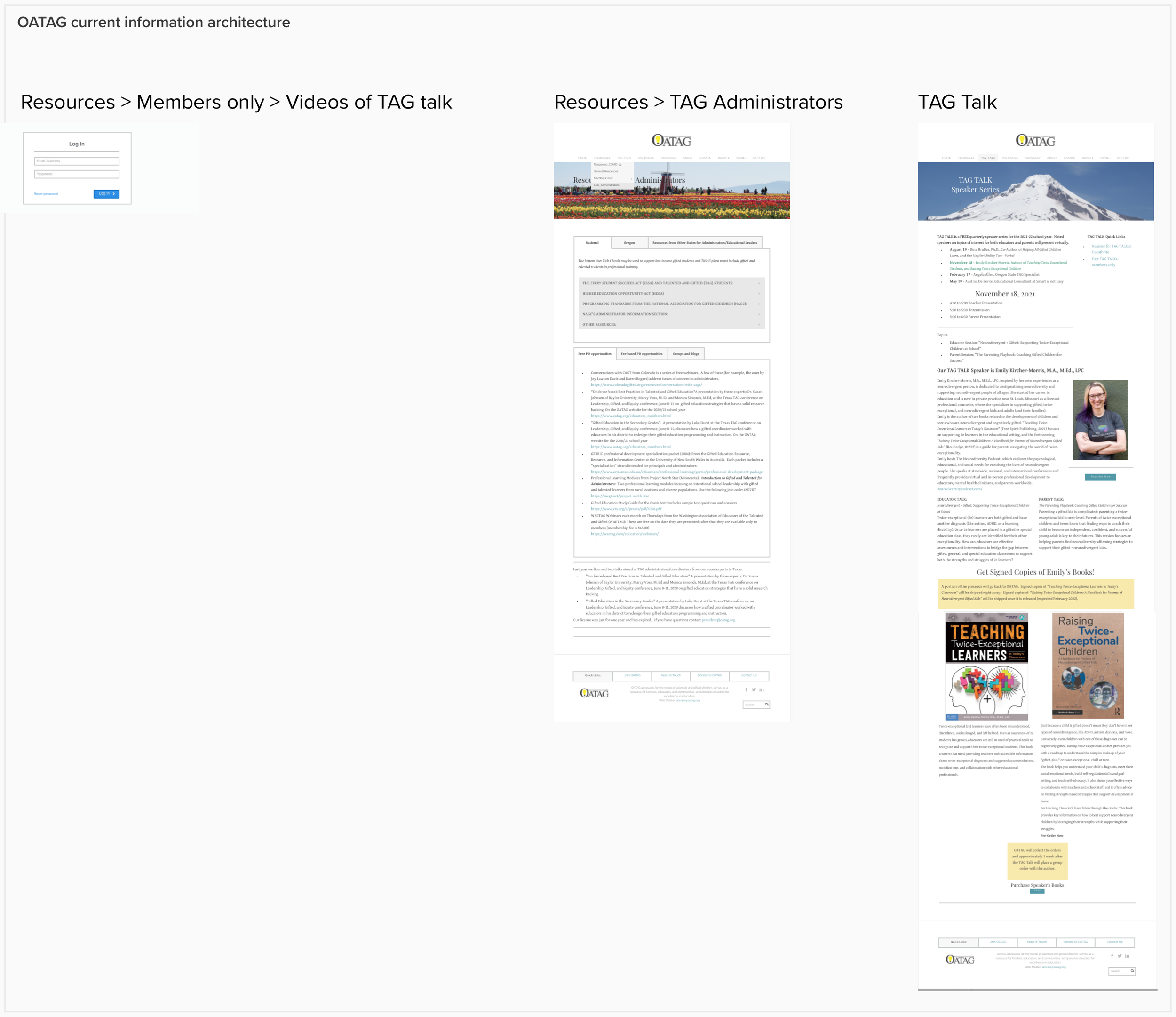
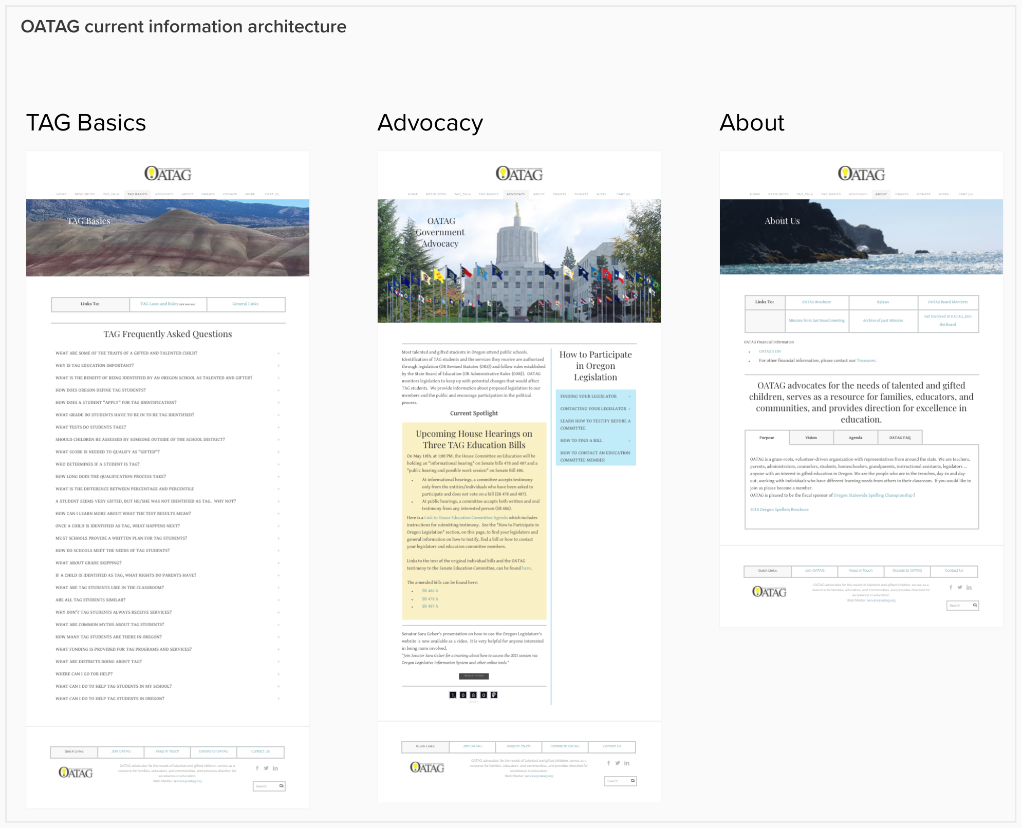
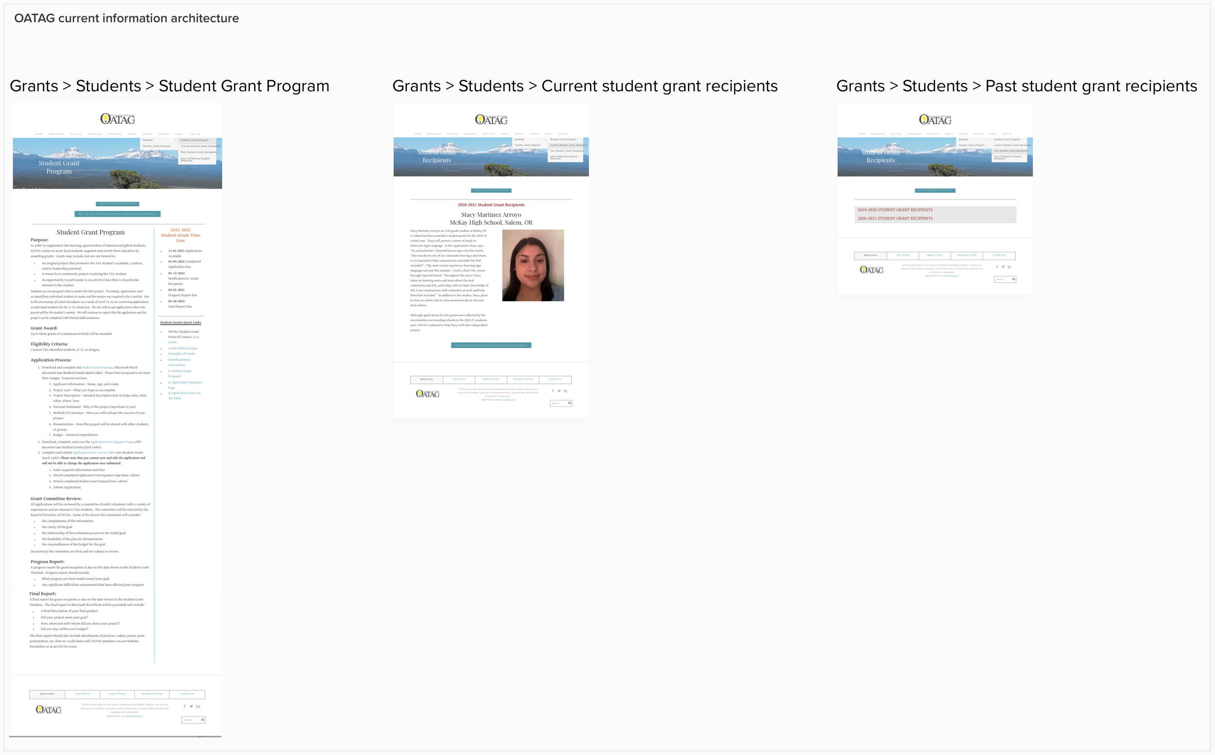
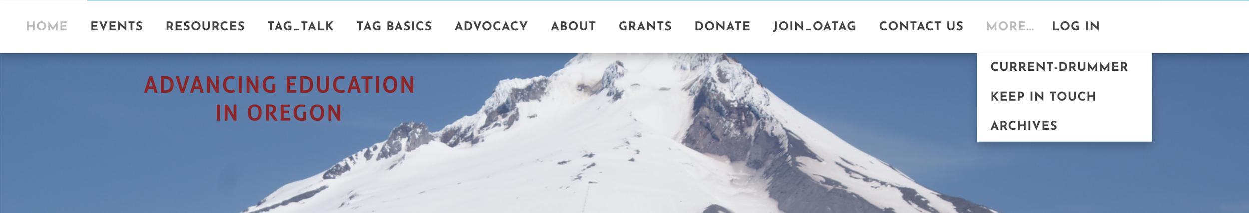
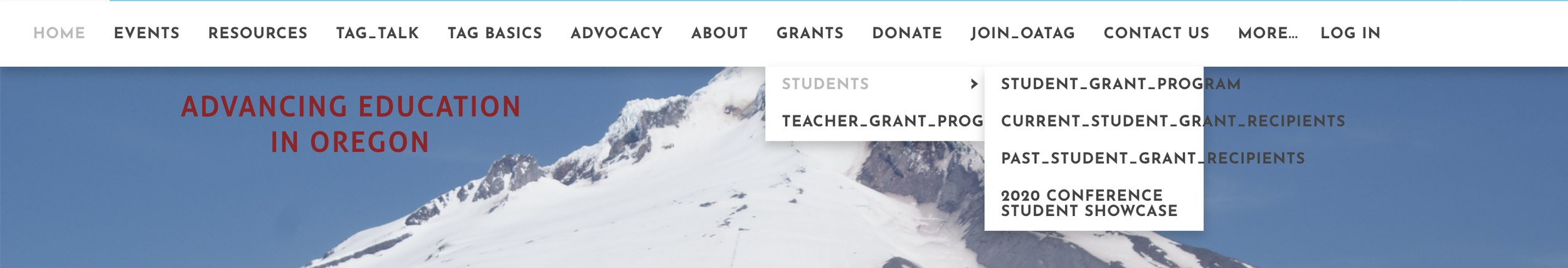
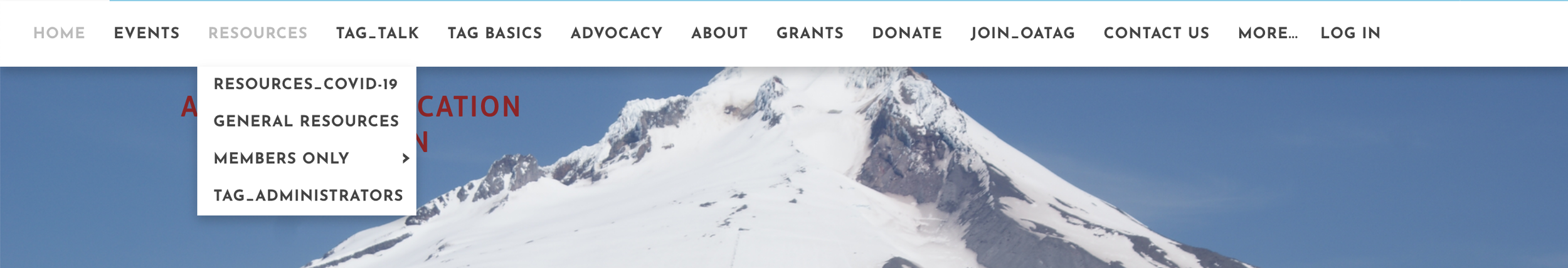
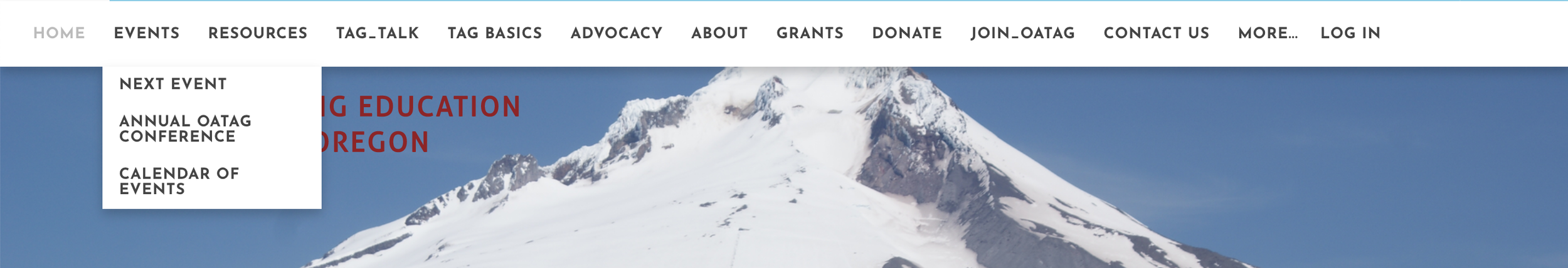
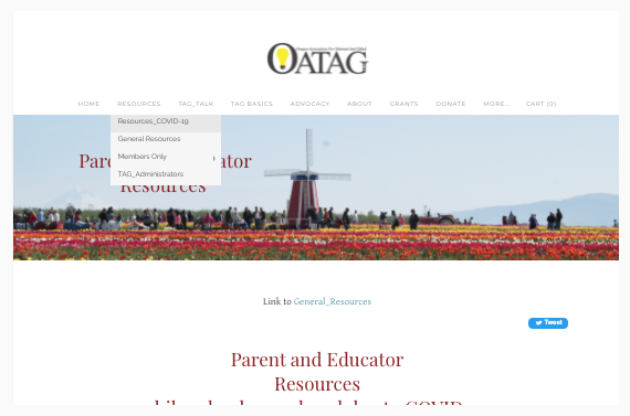
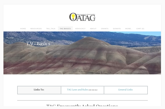
There are 13 items in the main navigation bar. Confusing where to go first, and what to do next. Too much granularity in the drop-down menus.
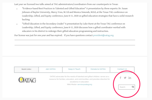
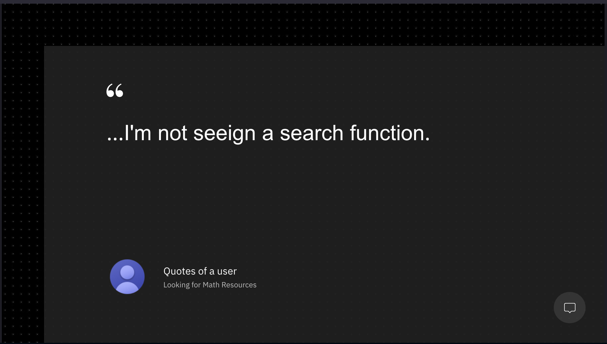
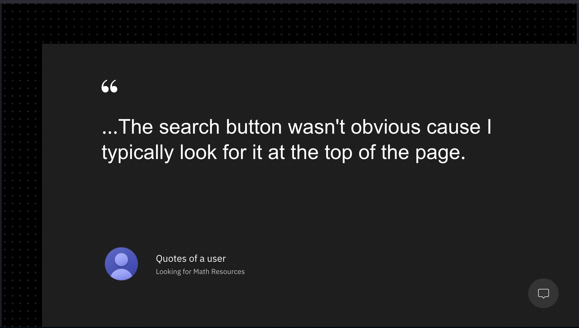
The search bar is positioned in the footer, at the bottom of the page. It doesn’t match universal patterns, and may not work for the user’s mental model.
Content and readability
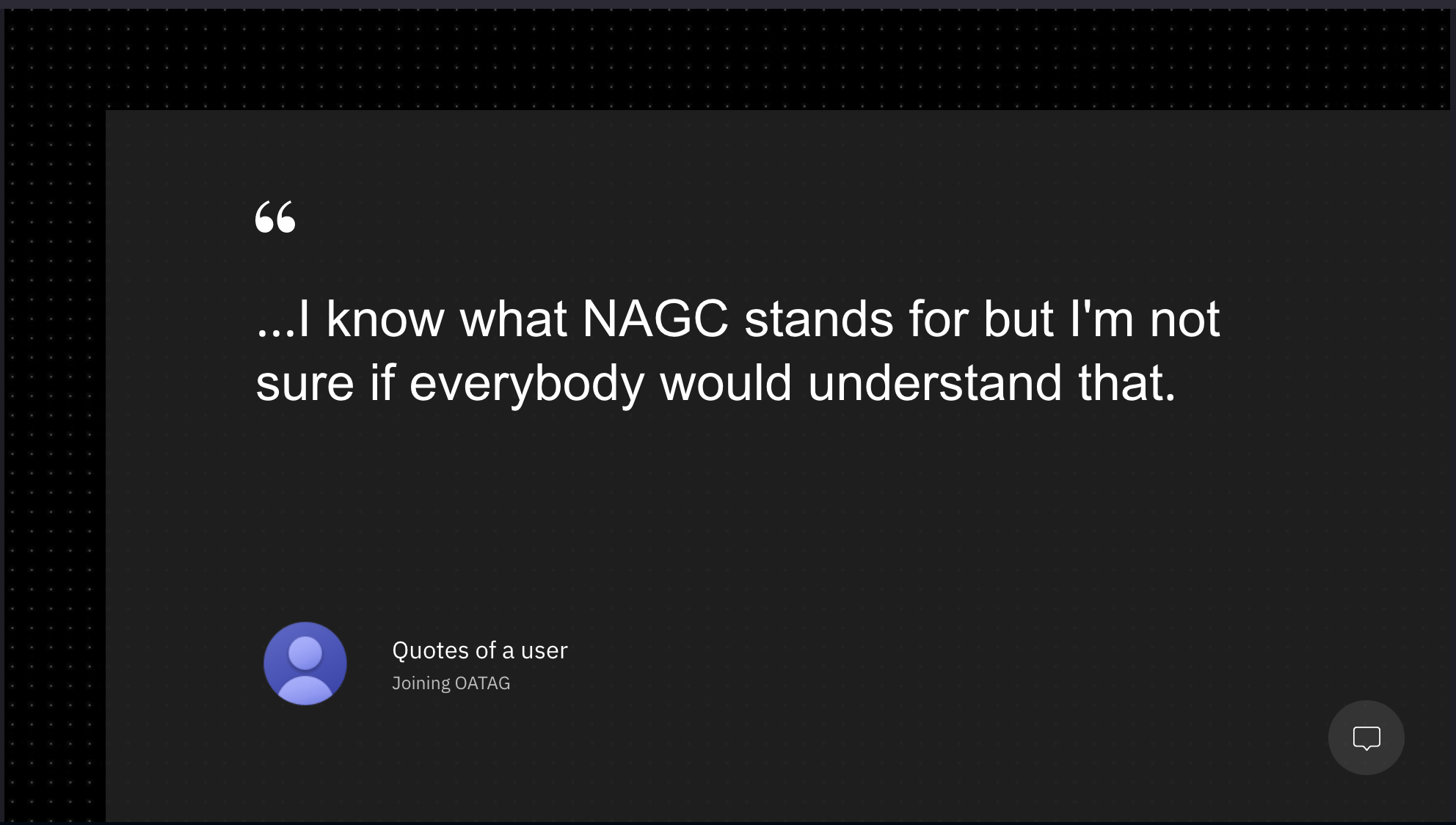
Acronyms are used in different parts of the site, from the logo to main navigation labels and descriptive text: NAGC, OATAG, TAG.
Too wordy. There are long blocks of text, hard to read.
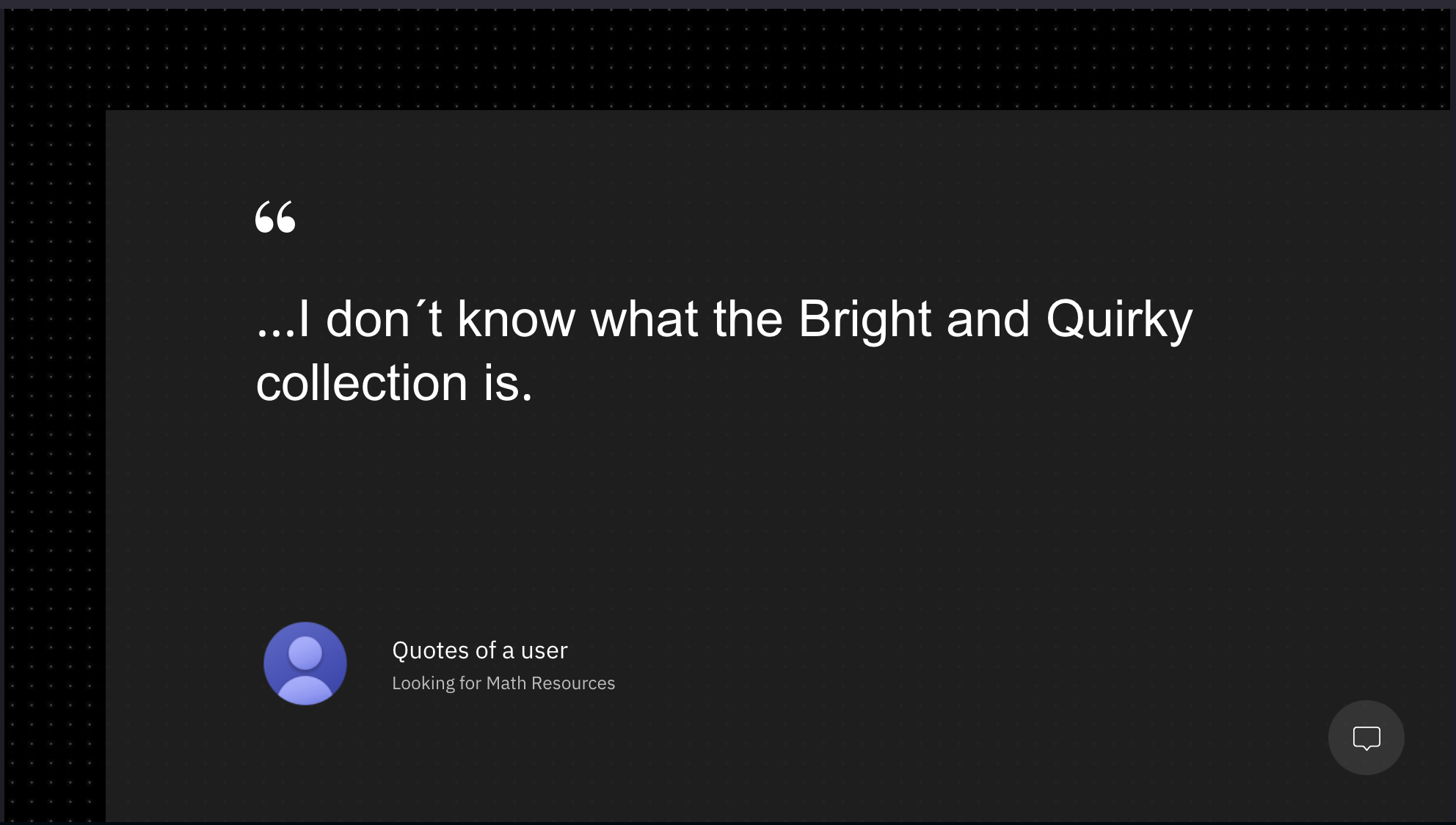
There’s unknown or not common terminology to label things: Current Drummer, Bright and Quirky Collection.
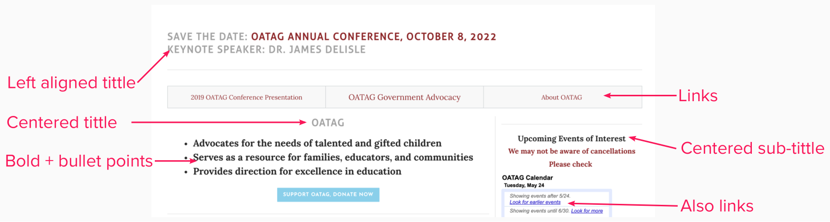
Inconsistency in the use of text styles and typography.
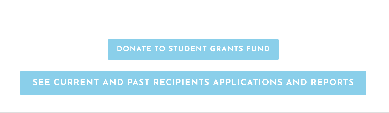
Not enough contrast between the white text (#FFFFF) and the blue background (#87CEEB) in the buttons.
Not enough contrast between the grey text (#E2E2E2) and the white background (#FFFFF) in the main navigation items.
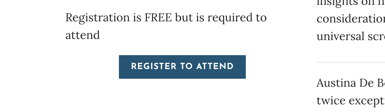
Text alignment is used inconsistently in titles, descriptive text, links, and buttons.
Visual
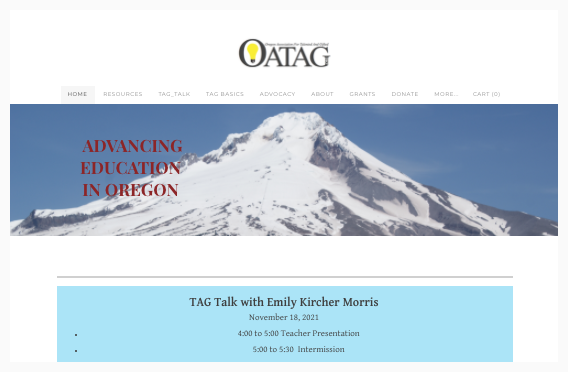
Very few images, and are not related to the topic covered.
Hierarchy - there’s not a clear distinction between what’s most important vs less important. The page looks crowded, with little white space for breathing.
Missing sections on the page, everything is piled up.
The approach: user research
I created our first research plan with a detailed script to test the website with 6 participants. We recruited 5 with the help of the website committee ( Margaret, Judi, and Bob).

We gave 3 clear tasks to the participants, to complete on OATAG’s website. We observed, and encouraged them to speak out loud.
Once completed, we followed up with questions.
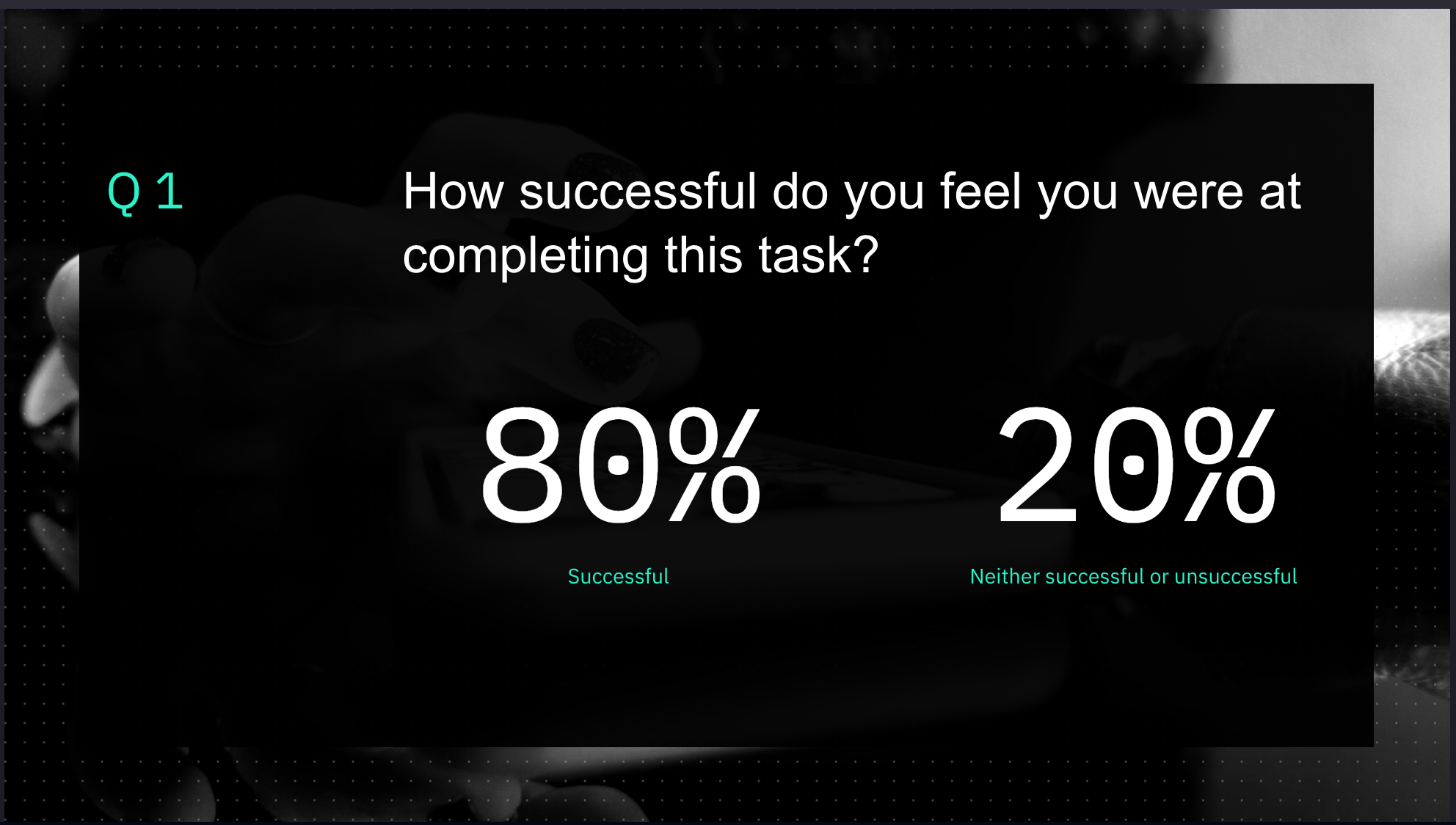
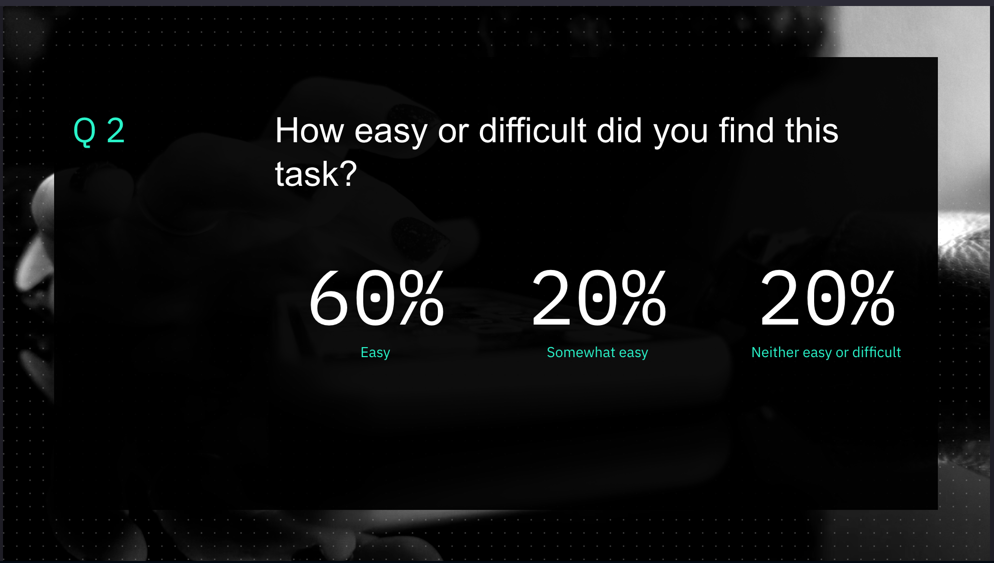
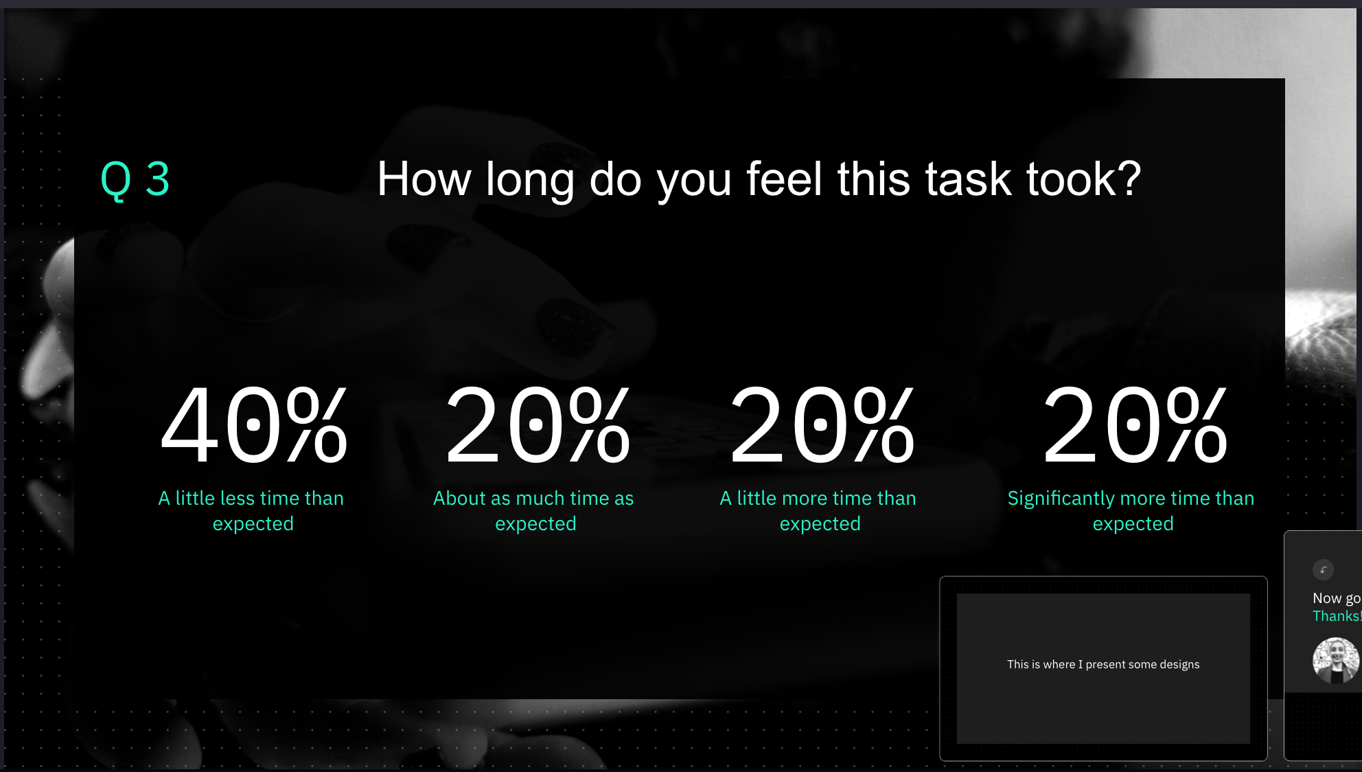
I moderated most of the sessions while the website committee observed, and took notes. We will debrief after each session. Once done with all participants, I presented the research findings to the Board with actionables.
And not only could I validate my assumptions, but most importantly, I helped the organization to stop for a minute and think about what they wanted/needed to accomplish with their website and their communications - turned out that most parents, and educators, know about OATAG thanks to the Events (TAG-Talks) and Facebook.
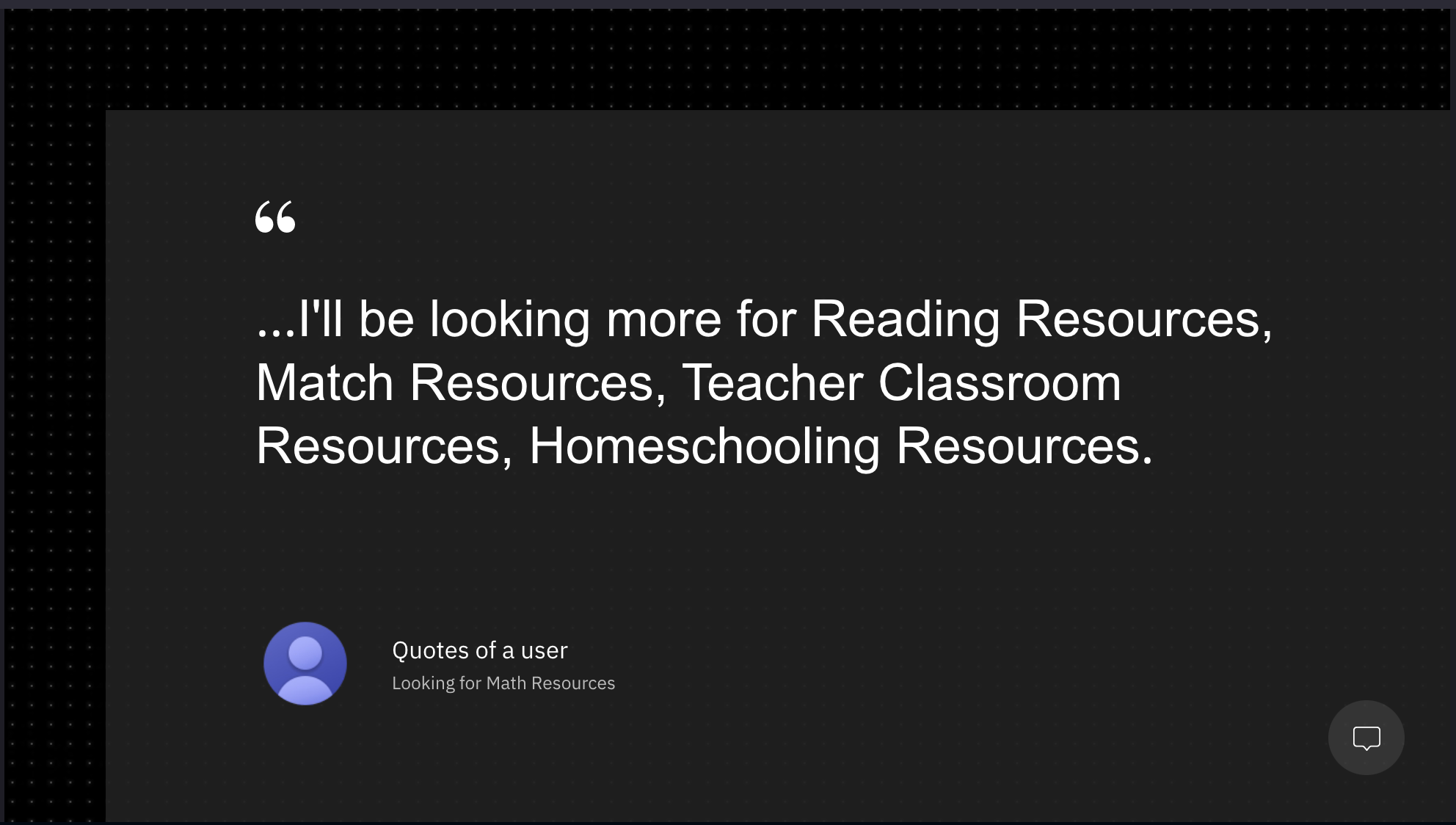
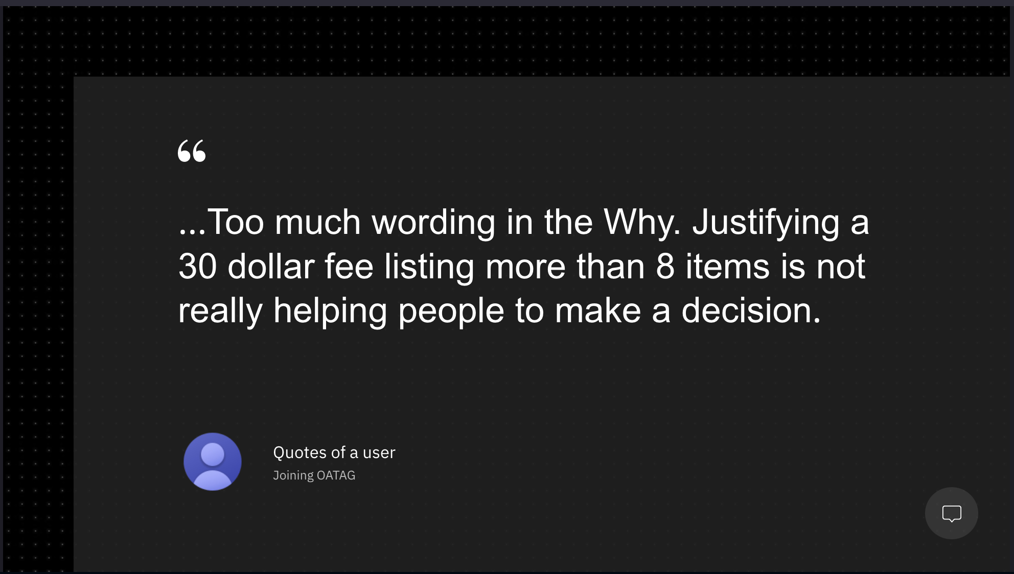
Let’s hear some quotes from users, this is gold :)
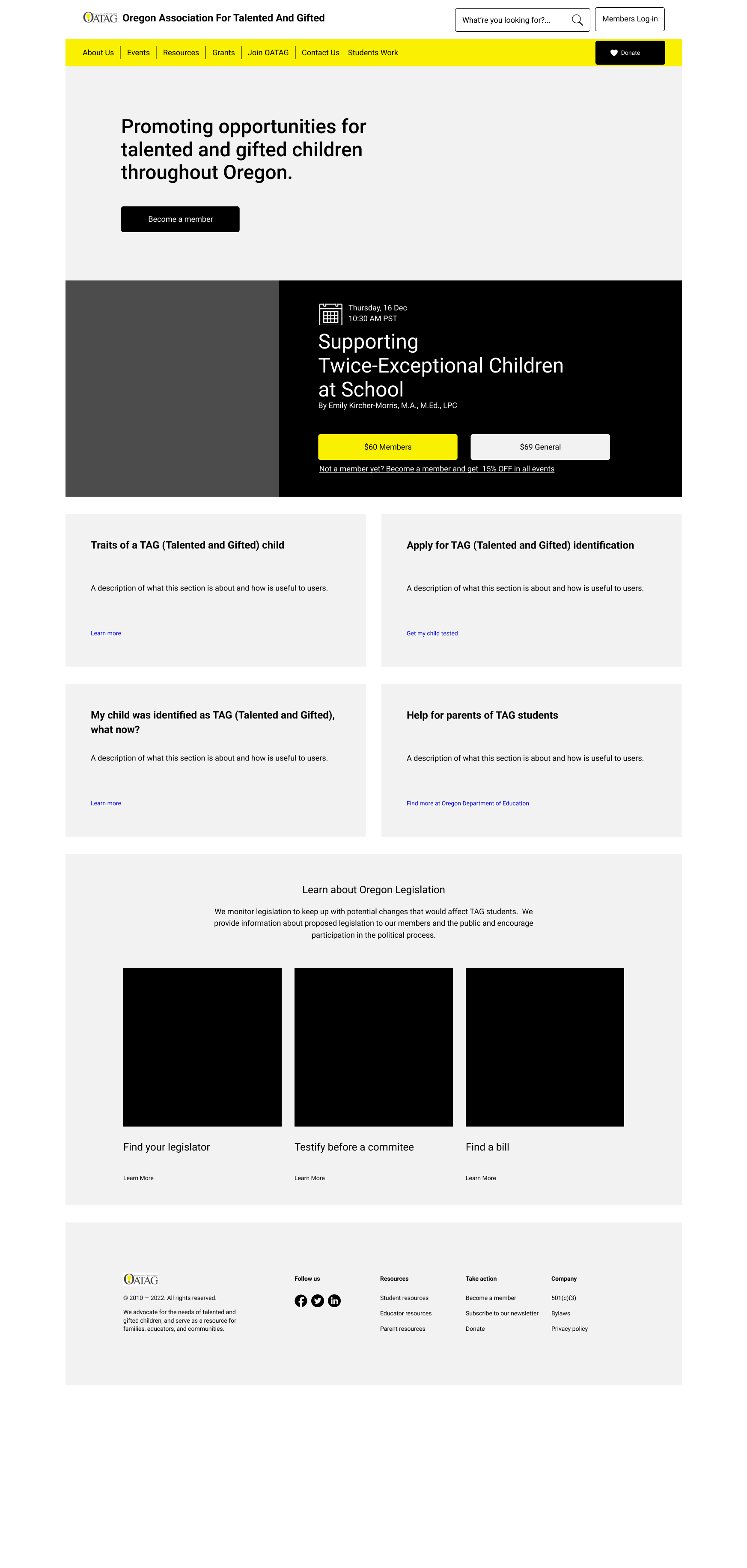
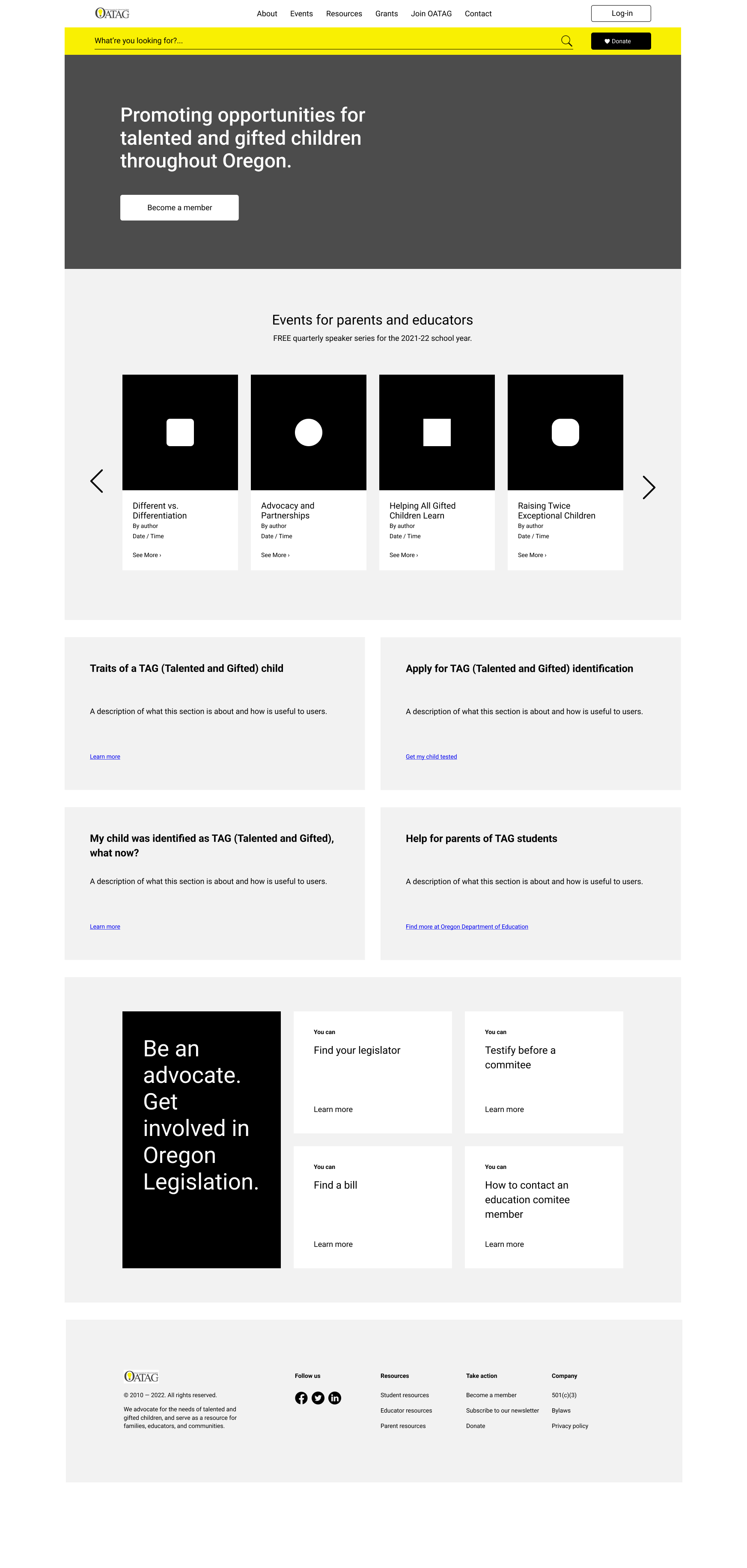
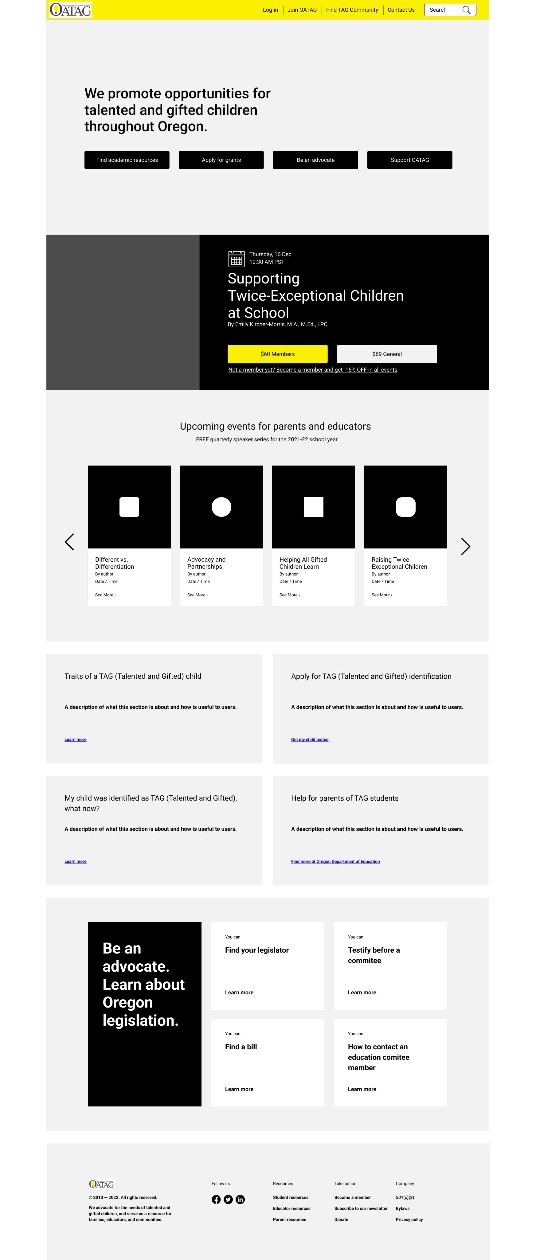
Initial explorations
We’re defining a layout for the Homepage based on key research findings. The page header, and the footer, will remain the same on every single page of the site. We decided to surface most of the information found in the FAQ frequented ask questions page on the homepage, as 100% of users expressed that besides resources, all topics covered in the FAQ are what they usually look for. OATAG continues to work on the content as different components (event cards, notification cards, registration forms, etc) will be designed to use interchangeably across the product.