
Providing visual cues for Tanya in the preview panel to test the conversation flow
Timeline: 2 weeks.
Deliverables: High fidelity mockups, demo, design specifications.
Design lead: Marilyn Osei.
UX, visual: Diana Alayon.
Product management: Jack Meyers.
Engineering: Dan O’Connor.
The problem
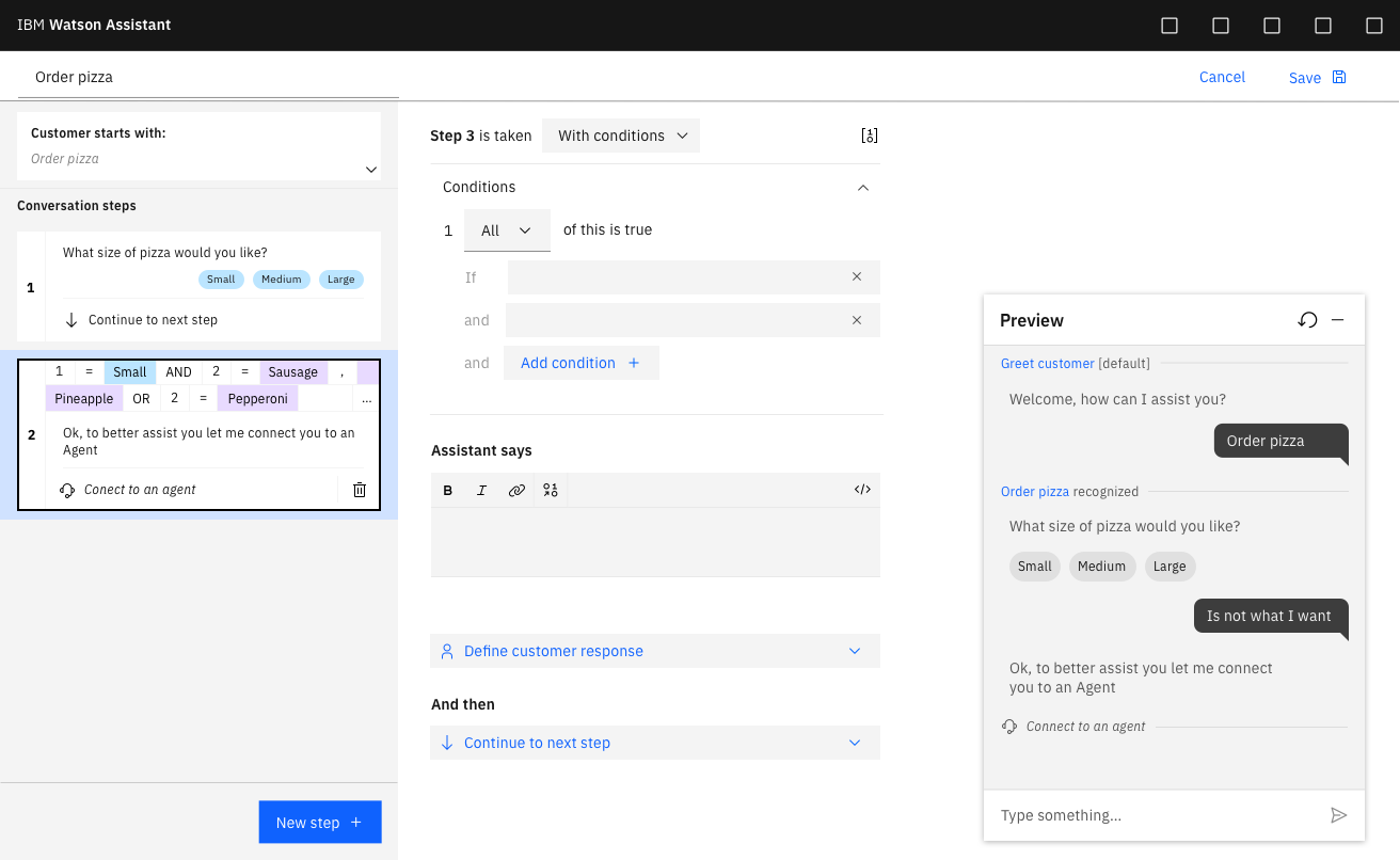
The preview panel is where Tanyas try - out the conversation they’re building: when they type in a request, they will get an answer according to the steps they’ve created.
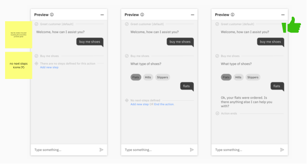
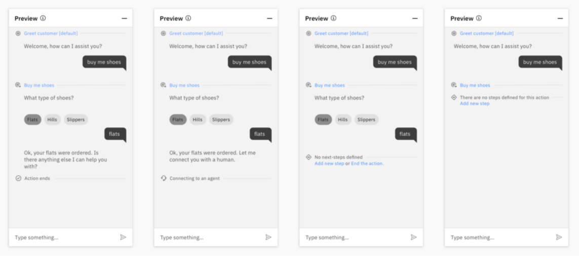
However, when Tanya lands in a new action, the first step is created and blank. When Tanya adds a few examples to the prompt step and then tests it in the preview panel, because the first step is created and blank when she types an example in the preview panel it looks like nothing has happened.
In another scenario, Tanya is in the middle of an action and has not defined an end step yet. When she tests out her action, it will just stop when she reaches the last step.
The goal
Tanya should understand that the action was triggered correctly.
Tanya should know that the action has technically ended even though she has not defined an end step.
How it works (old experience)

Understanding states in the preview panel
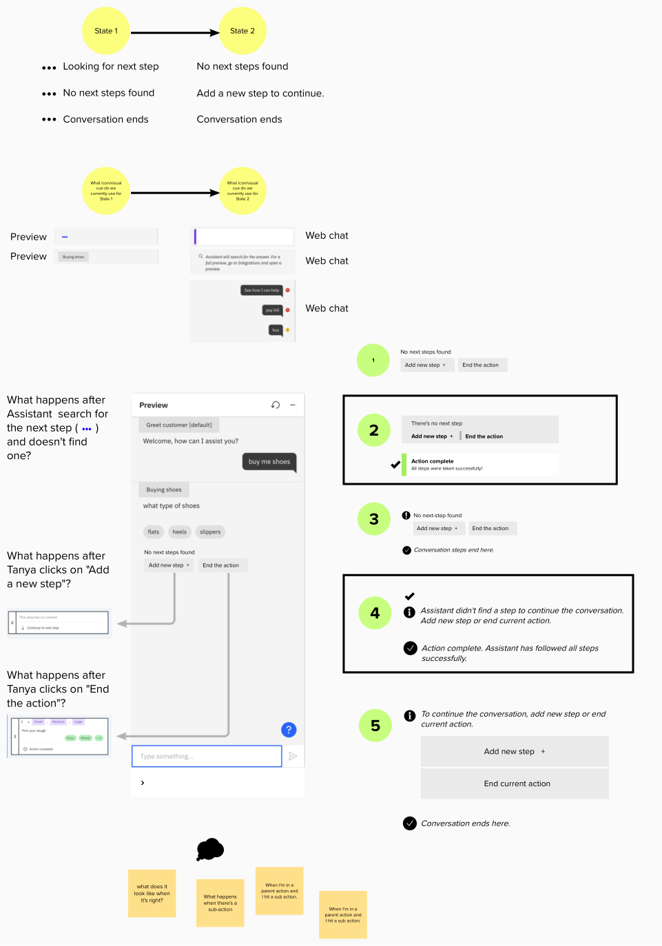
Key findings
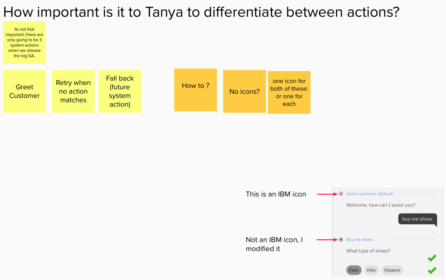
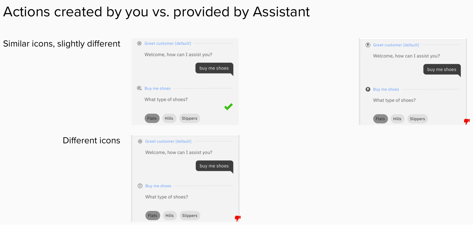
It wasn’t clear to Tanya what actions were created by her vs. actions provided by the Assistant (default).
The visual feedback provided in the preview panel wasn’t precise enough to distinguish what Cade (user interacting with the virtual assistant) says from what Assistant responds.
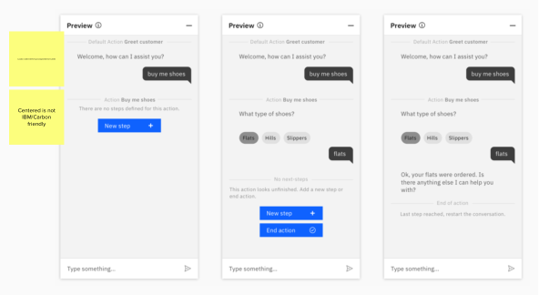
A nice-to-have feature could be when an action is unfinished, let Tanya know what she can do next.
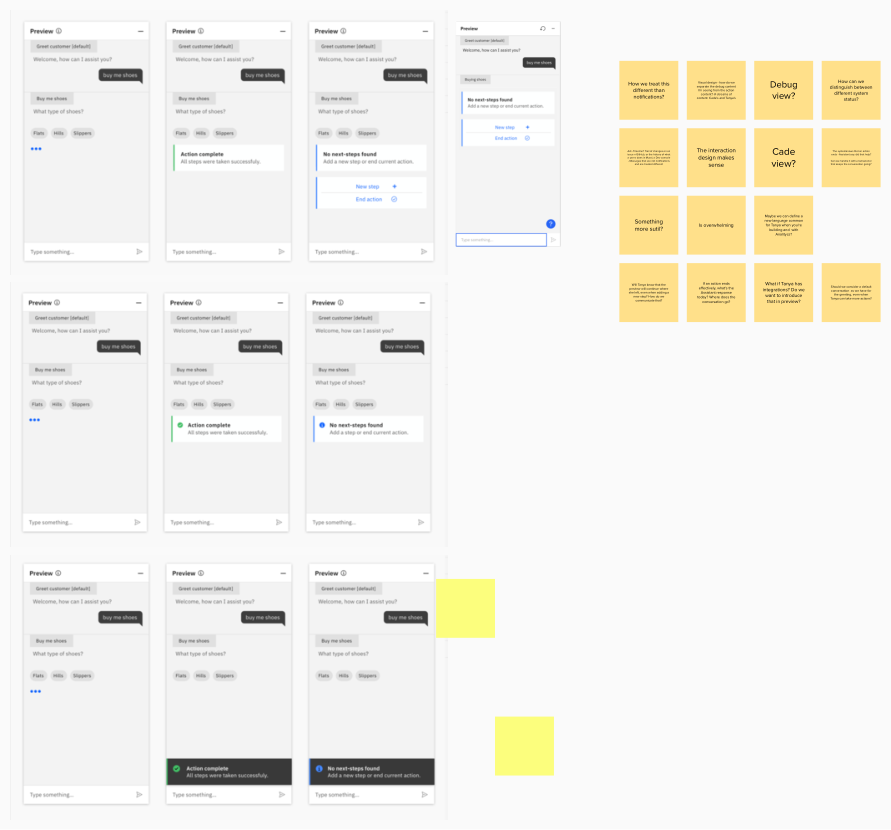
Initial explorations
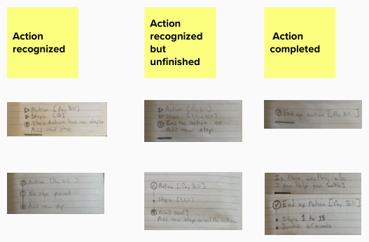
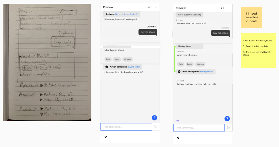
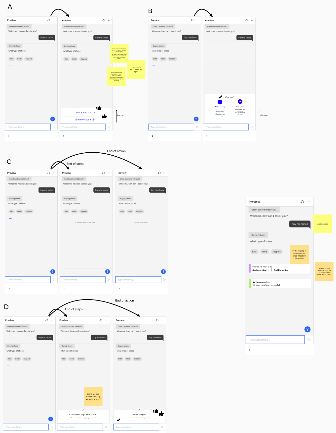
Further explorations
The outcome

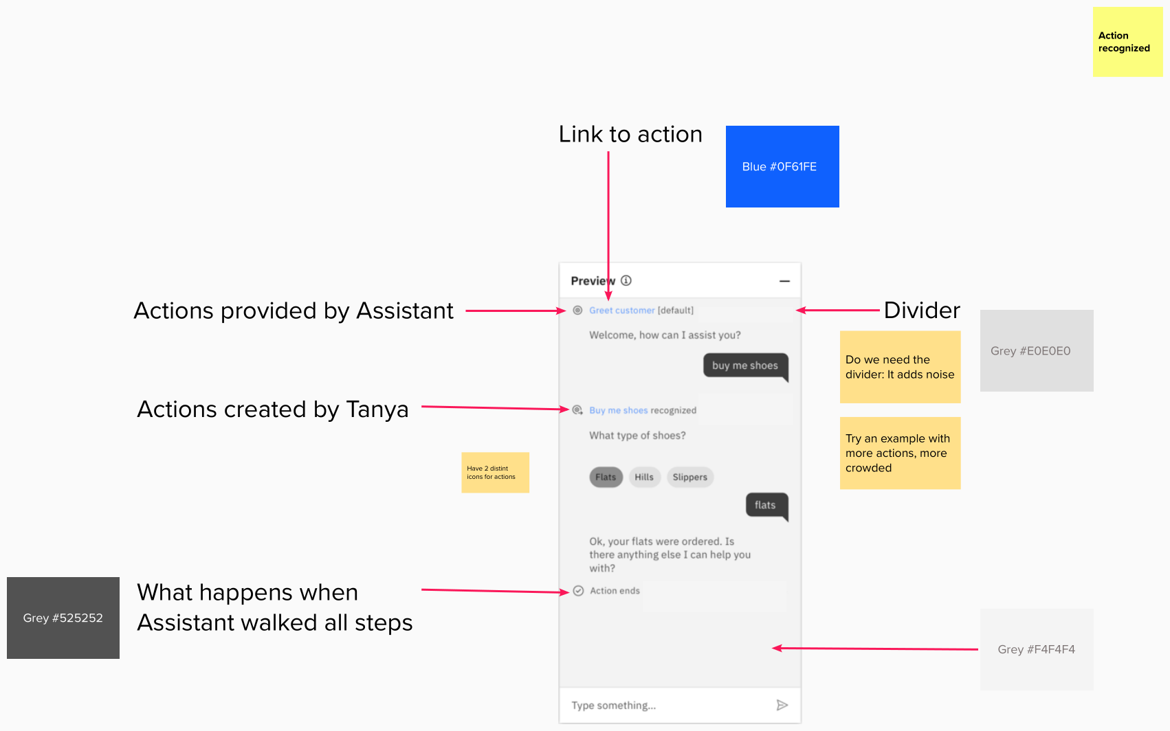
We added 5 visual cues for Tanya in the preview panel so that when trying out the conversation flow, she will know (1) that the action was triggered correctly, or (2) that the action has technically ended even though she has not defined an end step, or (3) that the action has ended and reached its end step, corresponding to what she has defined in the steps-builder.
The blue text is the name of the Action, to communicate Tanya that it’s clickable and different from what Cade says, and what the Assistant responds. It takes Tanya to the Actions page.
The grey text in brackets next to the name of the Action indicates the Action is provided by Assistant [default].
The grey text next to the name of the Action indicates this Action has been triggered.
There’s a divider line to create structure and separation between different sections of the conversation.
There’s an icon plus a label indicating that the Action has ended.